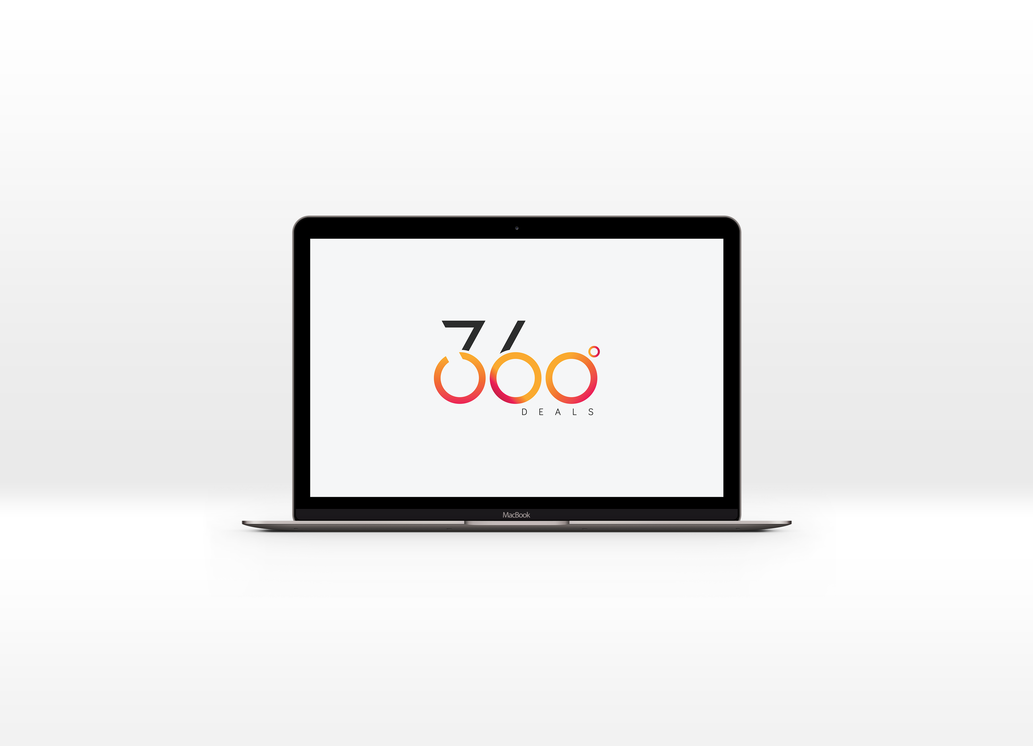
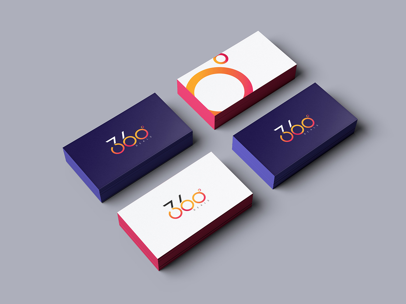
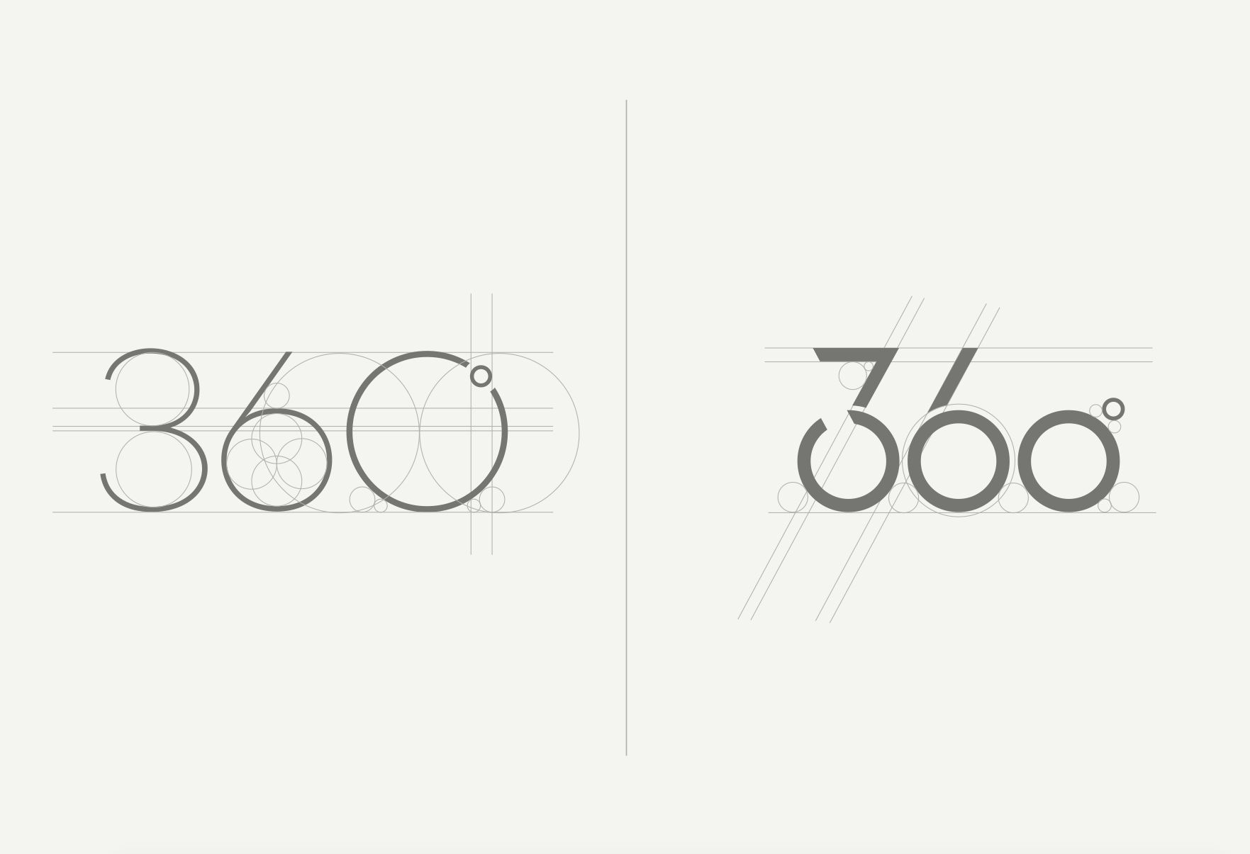
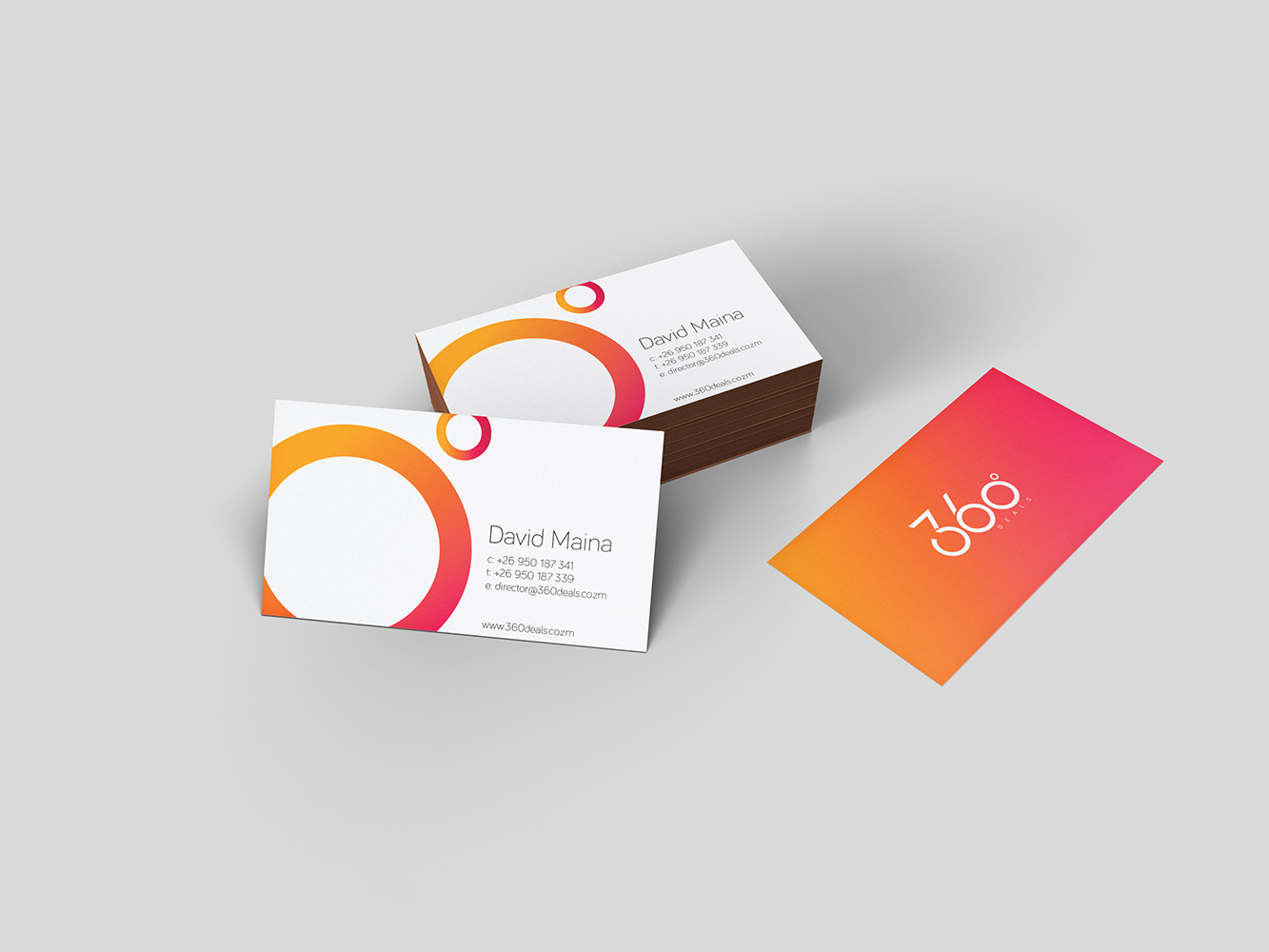
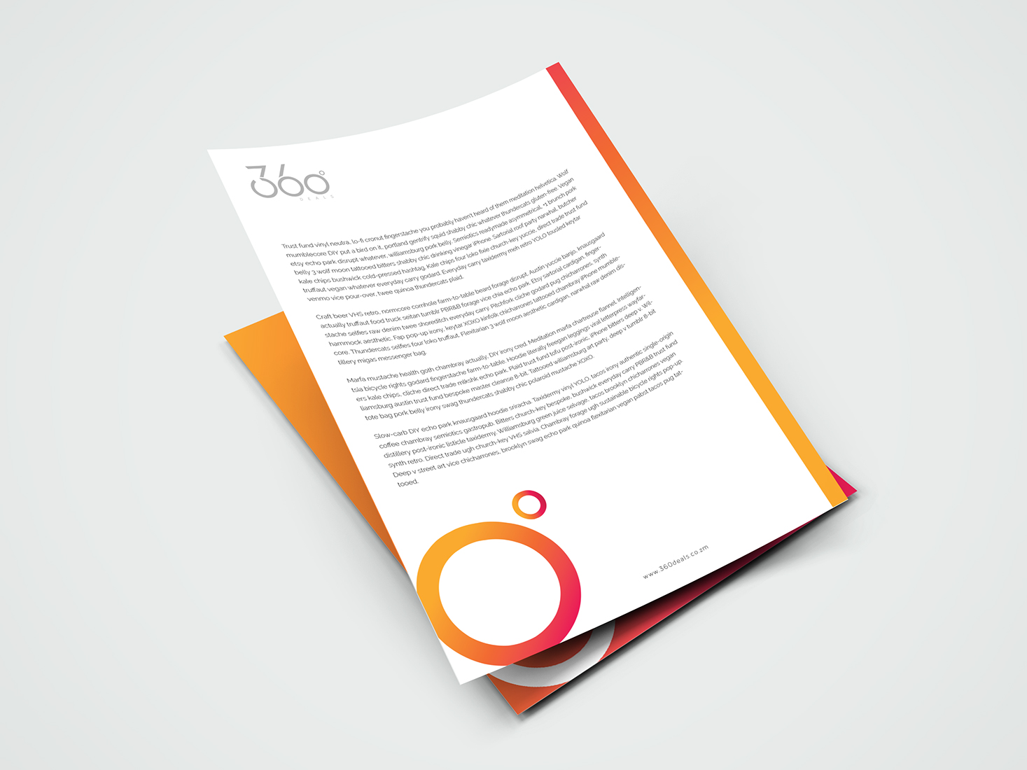
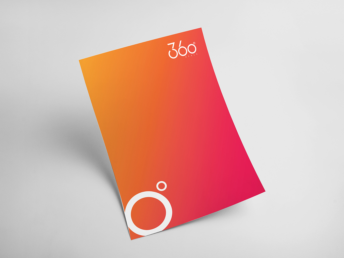
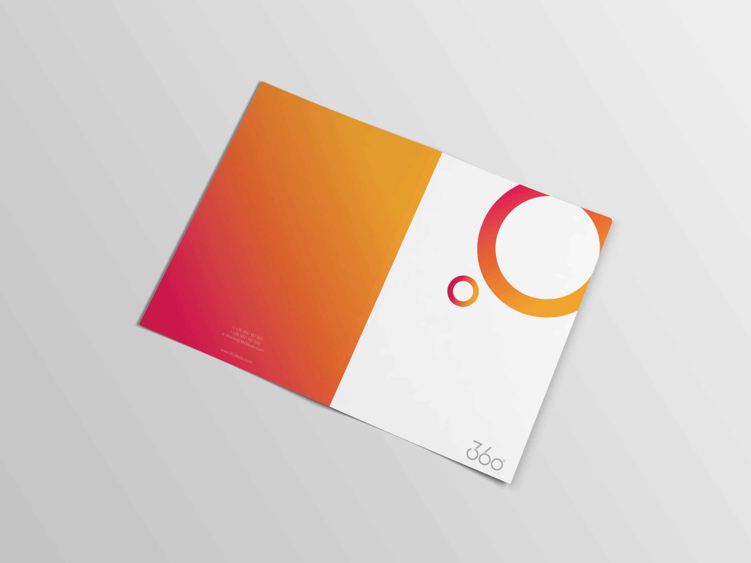
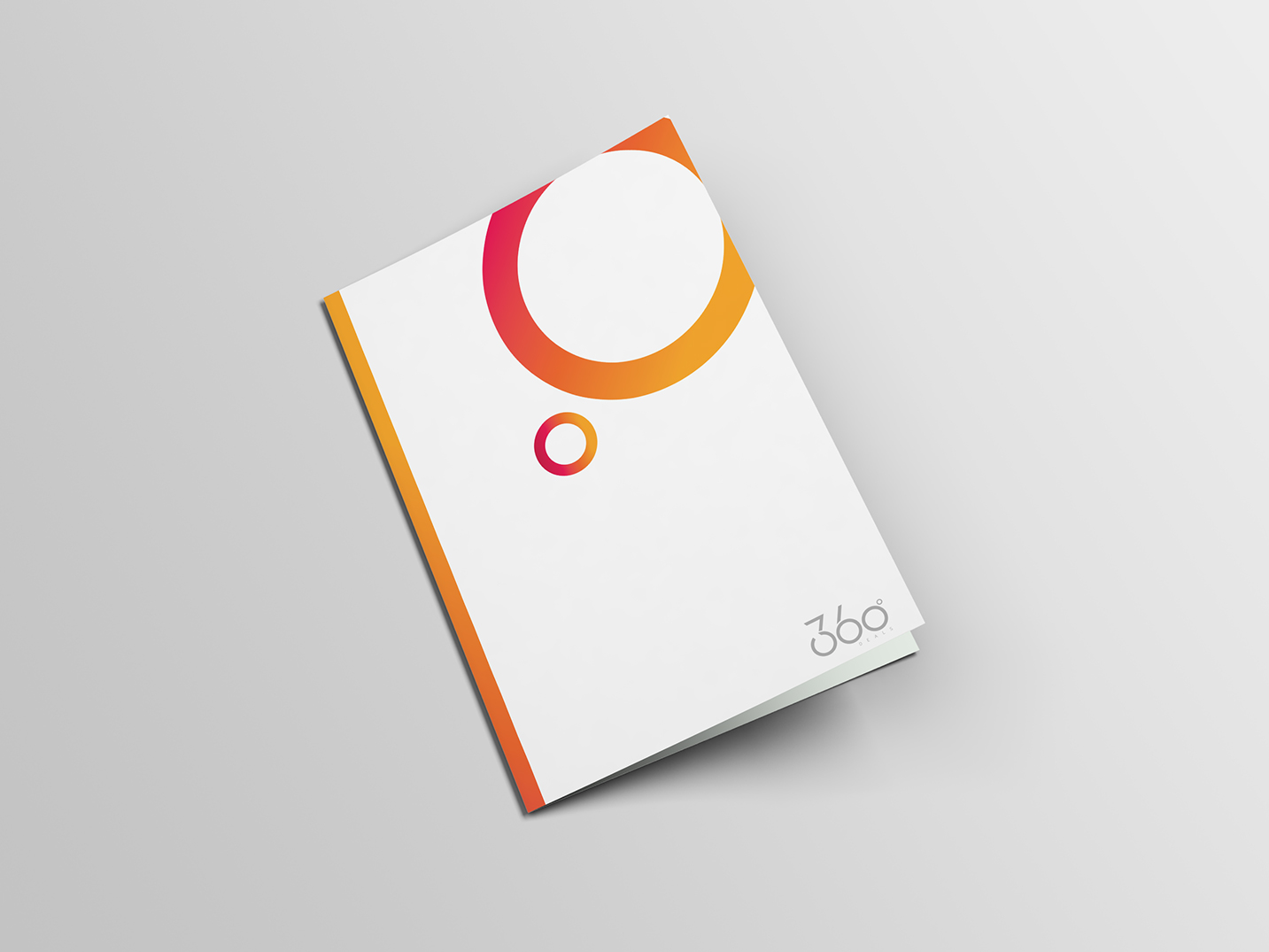
The design of the 360 deals logo concept is inspired by the simplistic geometric form of the circle, drawing form the brands name, we chose to emphasize the concept of the 360˚ logo form, thus highlighting not only the brands name but a more holistic approach. The logo design focuses the viewer towards the dominant figure of the “360” logo icon, which balances the simplicity of a typographic logo with an eye catching colour scheme. The logo is designed to put the brands name at the forefront, initially giving the viewer an instant understanding of what the brand is then establishing what it offers. The use of colour is intended to serve the dual purpose of drawing the audiences attention, and giving them a sense of vibrancy and positivity, whilst still being simple and elegant enough to work in multiple applications.
