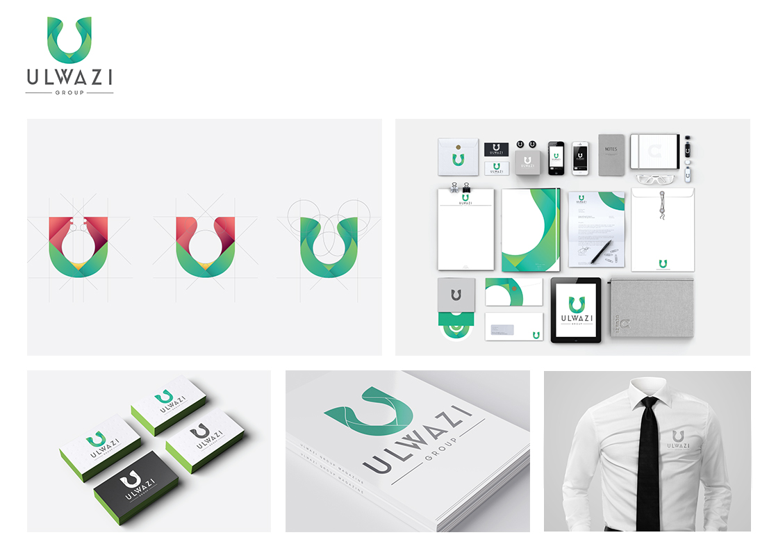
Simplicity Refined: Best Corporate Identities Collection
We’ve put together a list of some of the best corporate identities that we’ve created in the past 12 months. Simplicity is the ultimate sophistication. We always aim for minimalistic design style unless of course the client brief says otherwise. Our portfolio covers different industries from Construction, Investment, Multidisciplinary, etc. This shows our versatility when it comes to corporate identity design.
Investment
Rationale
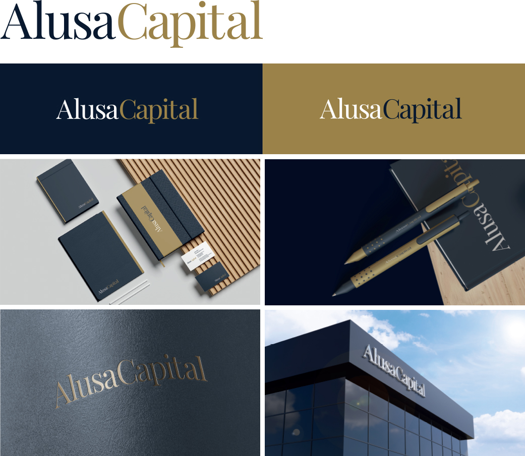
The Alusi Capital logo has been thoughtfully designed to reflect the brand’s commitment to professionalism, trust, and experience. The wordmark format, using the Playfair Display font, embodies the sophistication and elegance that align with the brand’s vision.
This serif font, known for its classical influence and modern refinement, communicates authority, tradition, and trustworthiness—key attributes for Alusi Capital’s target market, including Retirement Funds and private market investment managers.
The choice of navy for “Alusi” and gold for “Capital” reinforces these qualities. Navy, traditionally associated with trust, stability, and professionalism, speaks directly to the values that Alusi Capital wishes to communicate: being a trusted partner and a reliable guide in the financial world. Meanwhile, gold symbolizes success, achievement, and excellence, highlighting Alusi Capital’s position as an experienced and highly competent player in the market.
This careful use of color and font creates a logo that is not only visually striking but also deeply aligned with the brand’s core message. It exudes simplicity and sophistication without being ostentatious, signaling to existing and prospective clients—including Retirement Funds, private market investment managers, and service providers—that Alusi Capital is a firm deeply rooted in expertise and committed to delivering with precision and care.
The logo’s versatility allows for seamless application across digital platforms and corporate collateral, vensuring consistent brand identity in presentations, email signatures, letterheads, and more.
Our strategy for this transformative endeavor involves seamlessly blending modernity with the core aspirations of the brand:
1. Revamped Logo Design:
A Gateway of Warmth Our design vision revolves around a logo that serves as a gateway to a friendly, inviting experience. The logo’s design will exude a welcoming demeanor, encouraging clients to engage confidently while forging a sense of trust.
2. Inspirational Visual Language:
Nurturing Ambitions The visual elements we curate will extend beyond aesthetics, embracing symbolism that resonates with aspirations. These visuals will act as a bridge between mib Insurance and the younger audience, inspiring them to embark on journeys of security and growth.
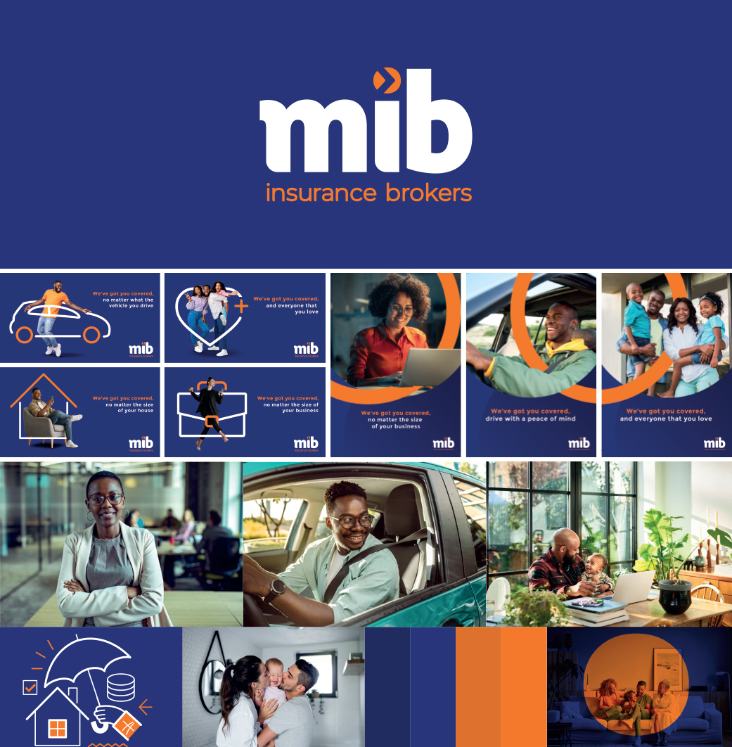
3. Dynamic Color Palette:
Evoking Vibrancy and Trust The chosen color palette of orange and blue is deliberate. Orange will infuse vibrancy and energy, while blue will anchor the brand in trust and reliability. The synergy of these colors will elicit positive emotions, making the brand memorable.
4. Digital Engagement Strategy:
Courting the Youthful Audience The brand’s revamped identity will seamlessly translate into its digital realm. The online platforms will reflect the new aesthetic, offering engaging content designed specifically to resonate with the younger demographic, fostering connection and loyalty.
A Bridge to the Future, Rooted in Values
The transformed mib Insurance will not only resonate with its existing clientele but also create a resonance with the emerging generation.
Conclusion:
Bridging Legacy with Innovation The rebranding endeavor for MIB Insurance is a reflection of the brand’s unwavering commitment to evolve while honoring its history. The revitalized identity will serve as a bridge between the cherished tradition and the contemporary spirit, inspiring the upcoming generation to confidently pursue financial security.
By skillfully marrying modern aesthetics, inspiring imagery, and a captivating color palette, MIB Insurance is poised to emerge as a beacon of trust and progression, resonating with both the seasoned and the emerging audience.
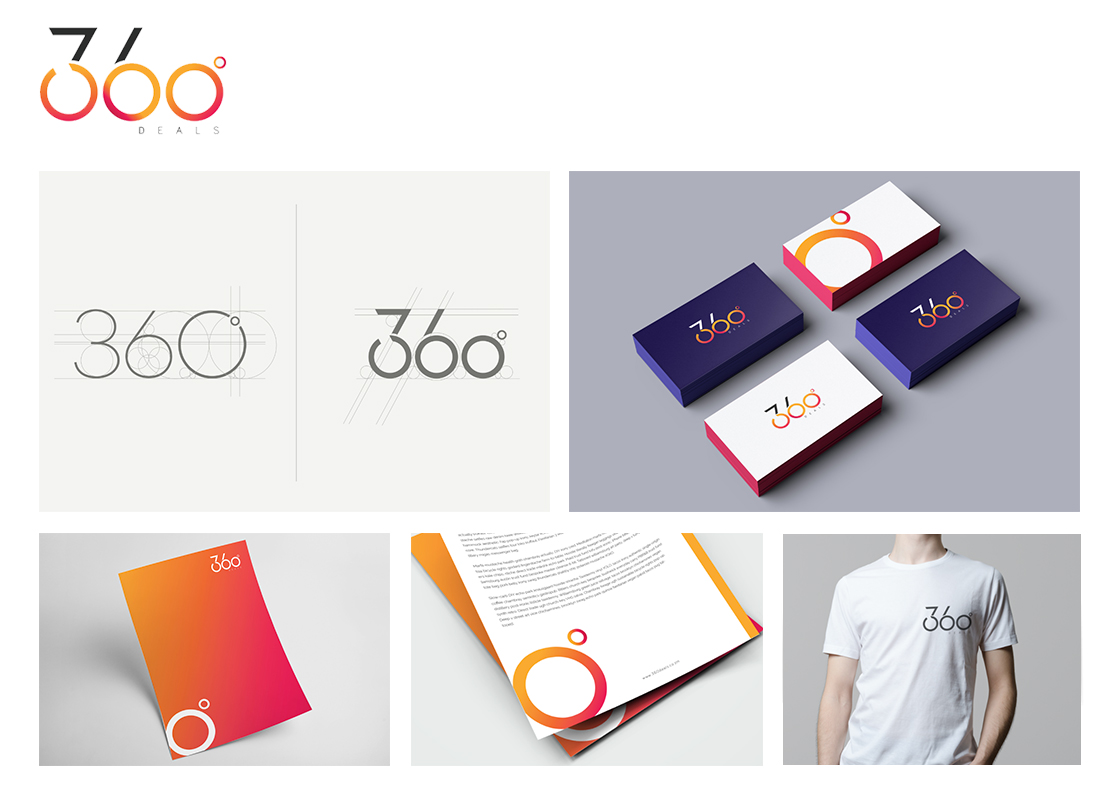
The design of the 360 deals logo concept is inspired by the simplistic geometric form of the circle, drawing form the brands name, we chose to emphasize the concept of the 360˚ logo form, thus highlighting not only the brands name but a more holistic approach.
The logo design focuses the viewer towards the dominant figure of the “360” logo icon, which balances the simplicity of a typographic logo with an eye catching colour scheme. The logo is designed to put the brands name at the forefront, initially giving the viewer an instant understanding of what the brand is then establishing what it offers.
The use of colour is intended to serve the dual purpose of drawing the audiences attention, and giving them a sense of vibrancy and positivity, whilst still being simple and elegant enough to work in multiple applications.
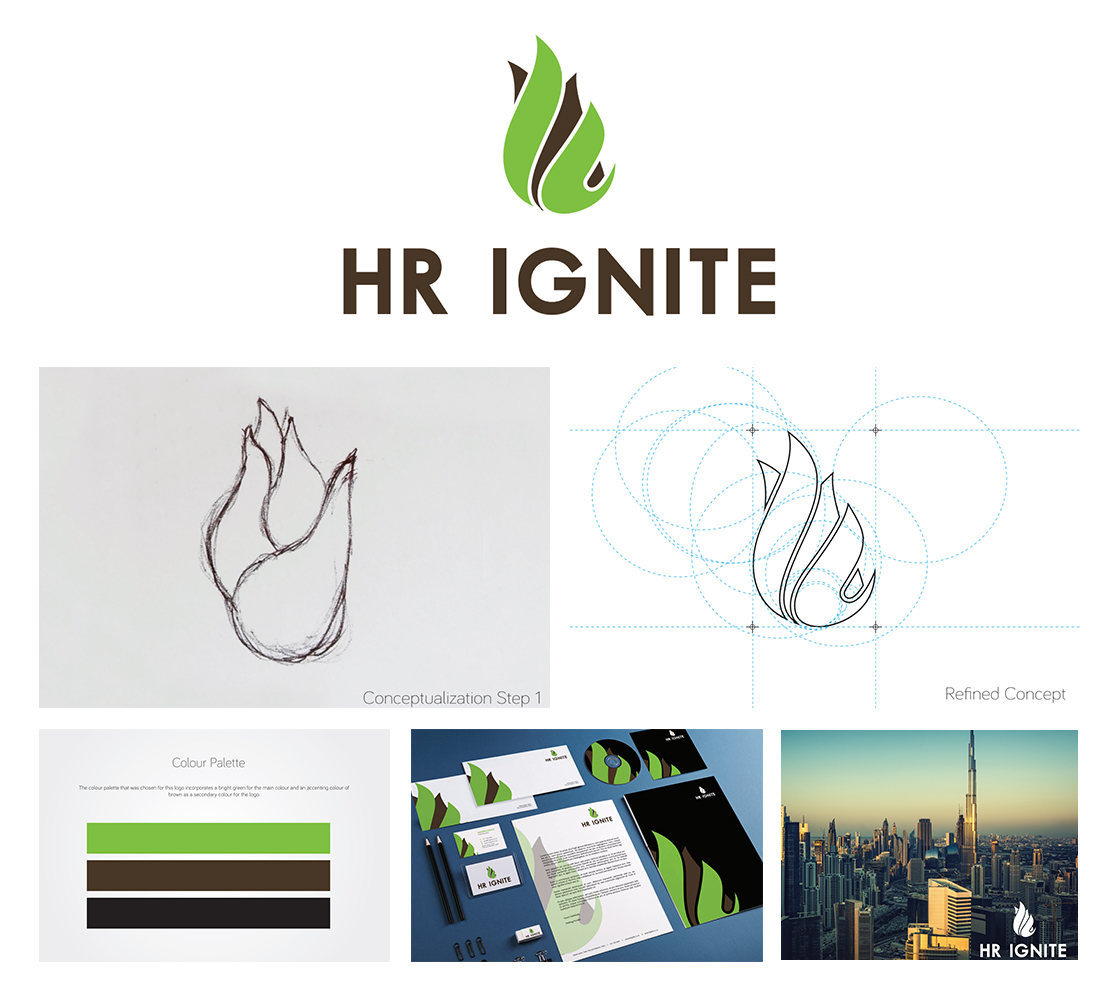
HR Ignite are HR consultants that provides solutions to suit the SMME market. The company helps grow businesses through effective human resources solutions. The concept for the logo is taken from the name of the company.
The word ‘ignite’, means to catch fire or to arouse and inflame. From the meaning of the word ‘ignite’ a concept was born. The logo consists of an icon and text. The concept for the logo icon is a flame taken from ‘ignite’. This logo represents what the company does, which is, Human Resources, building, improving and developing people. Finding a spark in people in order to ignite their potential in a company.
The colours chosen in the logo is green as requested in the brief. The colours used are green and brown
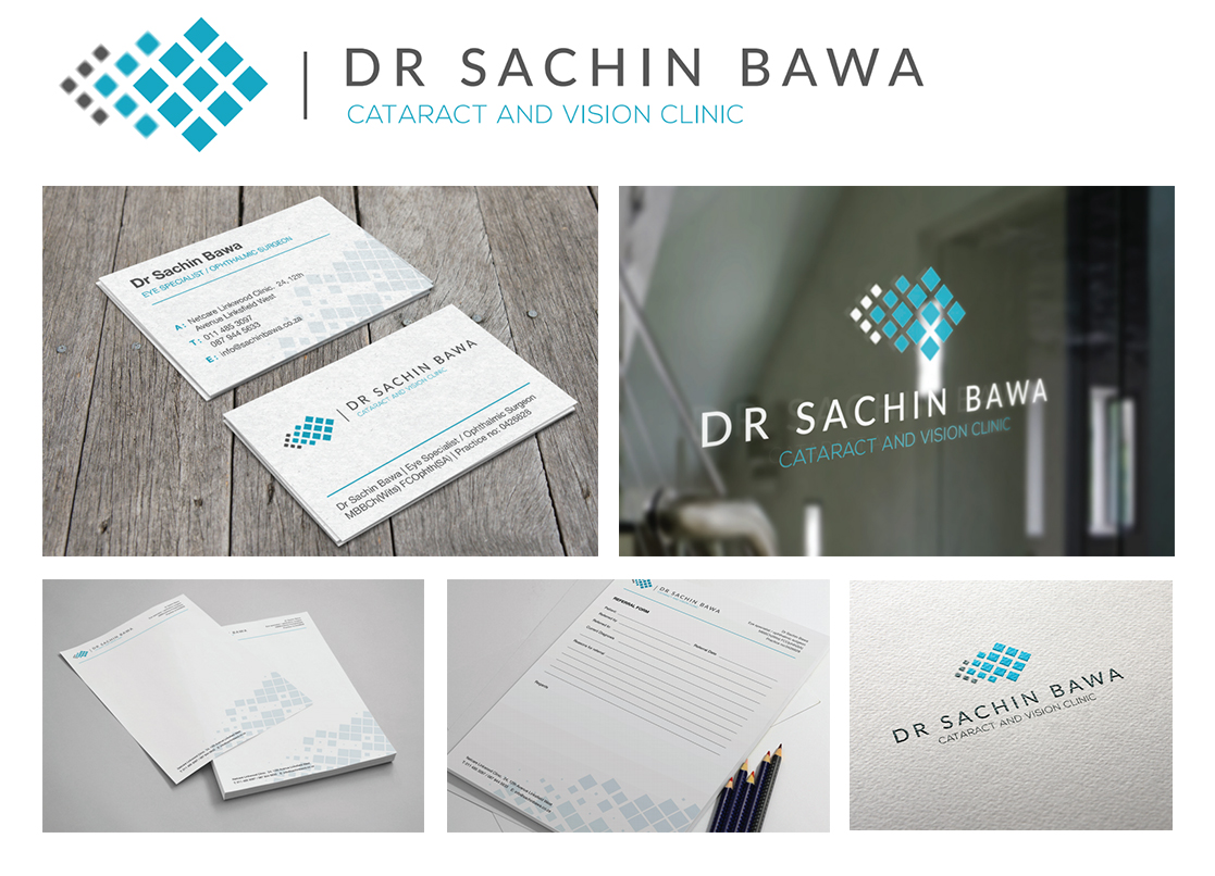
The concept behind the logo is to showcase the vision clinic and how they help people see better through surgery. We took the definition of cataract and used its meaning to define the idea behind the logo.
Cataract:
A medical condition in which the lens of the eye becomes progressively opaque, resulting in blurred vision.
The concept for the logo is blurred vision and focus. Logo icon shows abstract versions of blurriness and having focus as well. The logo uses shapes to represent focus against blur where the foreground of the logo is in focus and the background of the logo is blurred. It is also shown by the colours where the focussed part of the logo is in colour and the foreground is in grey.