28 Aug 6 Ways To Make Your Website To Stand Out

Everyone involved in building a website wants it to stand out from other websites. Clients want to stand out from the competition and leave a favorable impression on potential customers; designers strive for originality and to compete with other designers; back-end developers want a success story in their portfolios and an original or different-looking site can help with that.
Every business needs a stand out website. It’s no longer enough to simply provide a list of services and an “ About Us” section on your site. Your customers must be able to place orders, ask questions and make purchases through a seamless and delightful online experience.
- LAYOUT AND STRUCTURE
Okay, this is perhaps one of the more obvious ways to differentiate your site from the rest. It’s also the most difficult. On the pro side, using a fancy layout or site structure that no one has ever seen before is instantly memorable. It can also be a lot of fun. After creating your fifty-second three-column site, mixing up the layout provides a challenge for your visual design skills and your front-end dev skills that can’t be beat.
The cons: There are only so many ways that information can be organized before you start to lose accessibility and usability points. The development time is often increased, as you end up working to solve problems few have encountered before. Layout should ideally not depend on JavaScript.
- BRANDING
Branding is the other really obvious way to make your site stand out. And it’s easy. Just find out what your client’s branding guidelines are, and stick to them. Embrace them. Make your client sick of seeing their own logo and colors. Then maybe tone it down a little, and you’re good to go.
The content should be laid out so that what’s most important is most easily found. Never overload your audience with too much information and never force them search for the essentials.
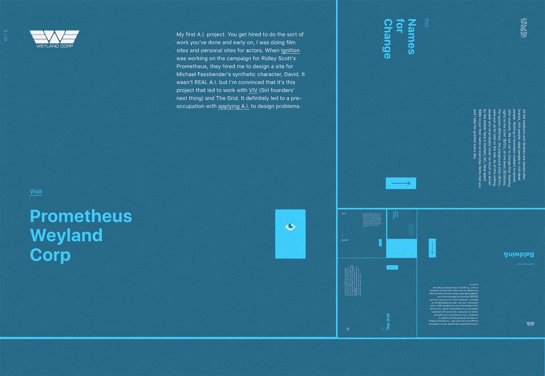
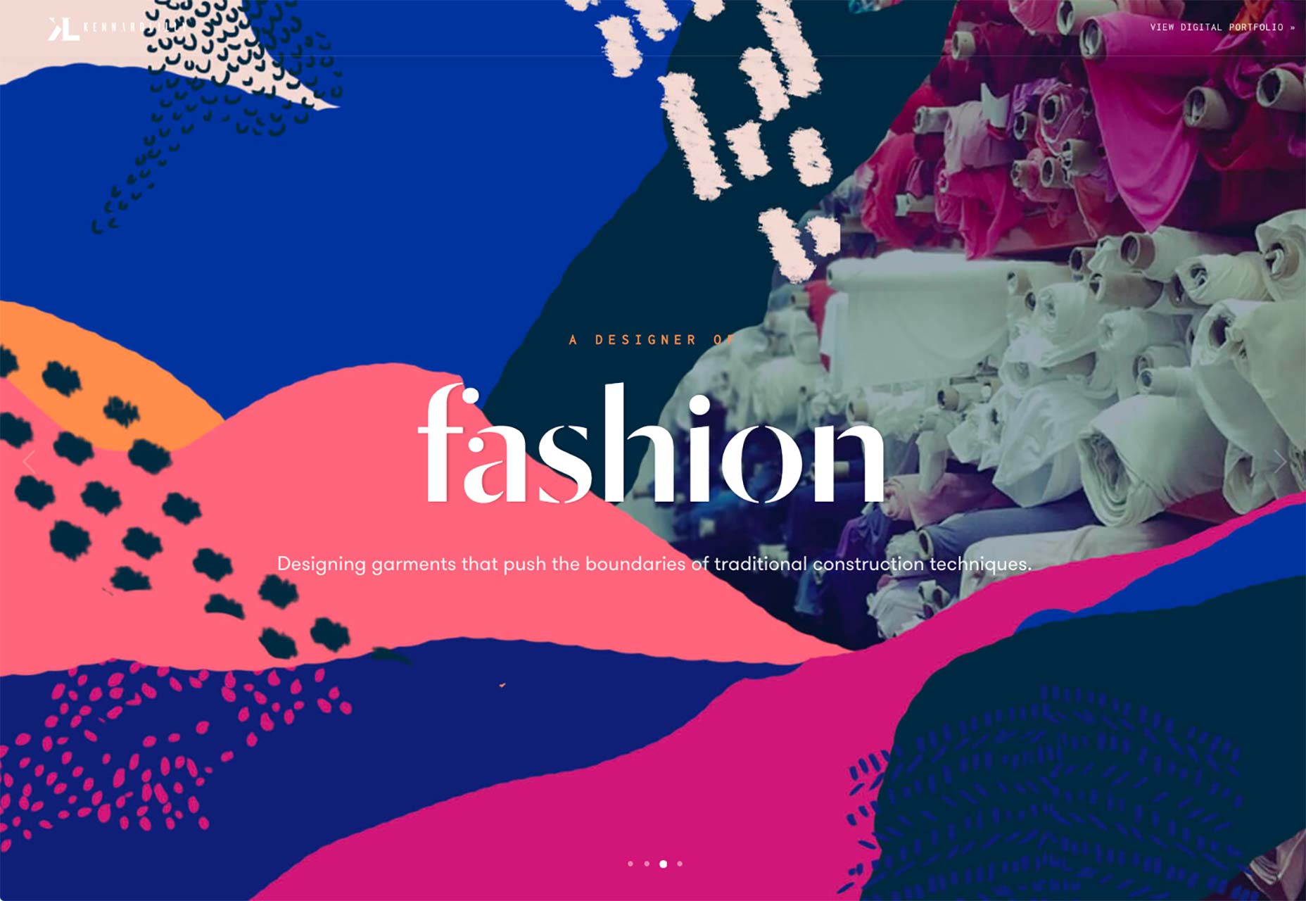
- GRAPHICS AND IMAGERY
If the branding isn’t enough, you can use graphics and/or photos on your site to establish a distinct visual style. Sites with big images do tend to convert more, after all. People are visual creatures, so visual stimuli can make it easier for users to connect with you on an emotional level. Graphics and photos are just one of the tools you have in your design toolkit, not the only one. Plus, the stylistic options are just about endless, which makes it easier to create an original-feeling design.
The cons: Graphics and photos that look original are expensive, because they pretty much have to be custom made. You can attract attention with words or graphics.
- TEXT AND CONTENT
This is probably the most important and sometimes the most difficult way you can set yourself apart. What is said on any site can and should be a reflection of the client’s personality and/or company culture, while still being clear. You can use copy, microcopy, and even things like video to communicate personality in a way that sets you apart.
A great website is nothing without original content. The secret to keeping your audience engaged
The cons: Ok, first you have to get any text at all from your client. Then you have to get copy that actually feels like a human wrote it.
- FOCUS ON USABILITY AND SIMPLICITY
A great website must be easy to navigate. The design must be clean the layout intuitive and have design elements that are cohesive. This enables your customers to find your content easily– whether they’re using a desktop computer or a mobile device. Because, at the end of the day, what good is a website if no one sticks around to use it.
- ANIMATION
Animation is a huge deal right now, and for good reason. When done right, it can take a pretty good experience and make it unforgettable. Animation is not just for cartoons anymore. From full-screen moving images to small hover effects, touches of animation are popping up everywhere. Animation is trendy, fun and user friendly. Well make those pictures start moving. What makes animation trendy is realism. In today’s design landscape with so many flat and minimal style designs, users need more cues to tell them what to do.
The cons: I saved animation for last because it’s very effective, but also very hard to get right. That means that if you want your animation to stand out from everyone else’s animation, you’ll have to step up your game. The key to animation as a design trend is moderation. But if you start mixing up too many different moving effects, it can cause complete chaos.
.