Skip to content
Team
Work
Services
Team
Work
Services
Book a Call
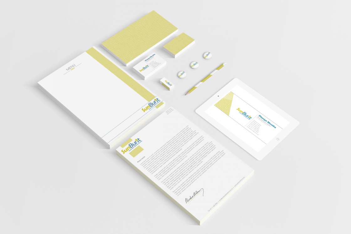
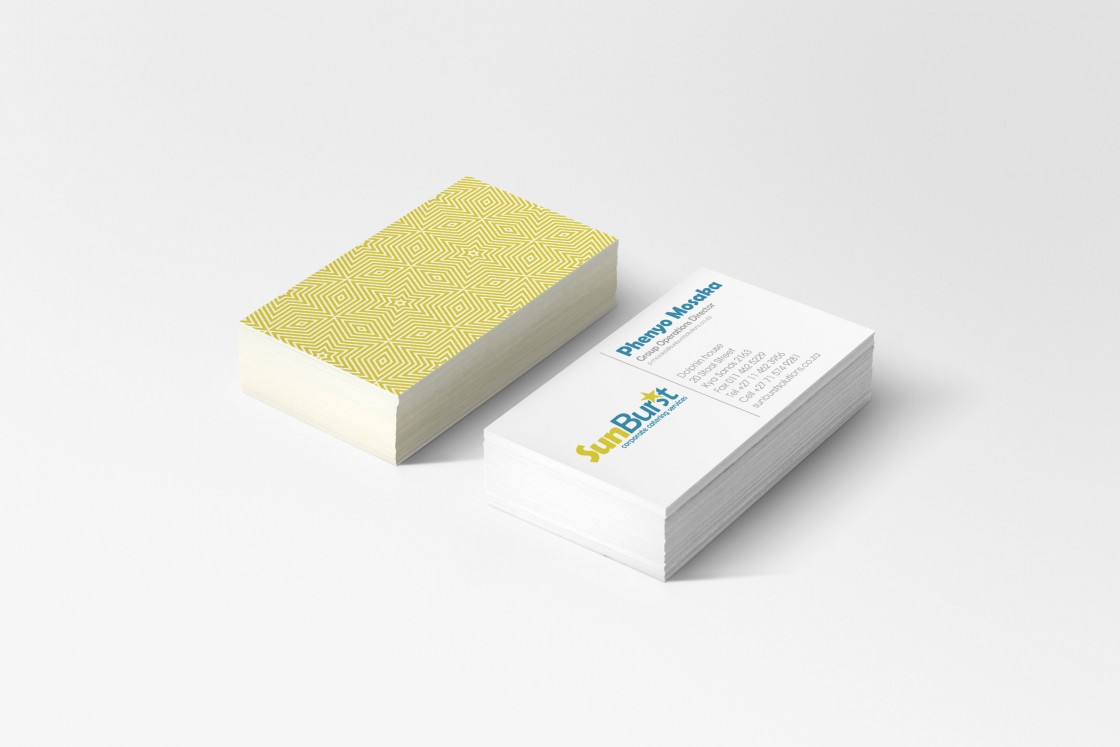
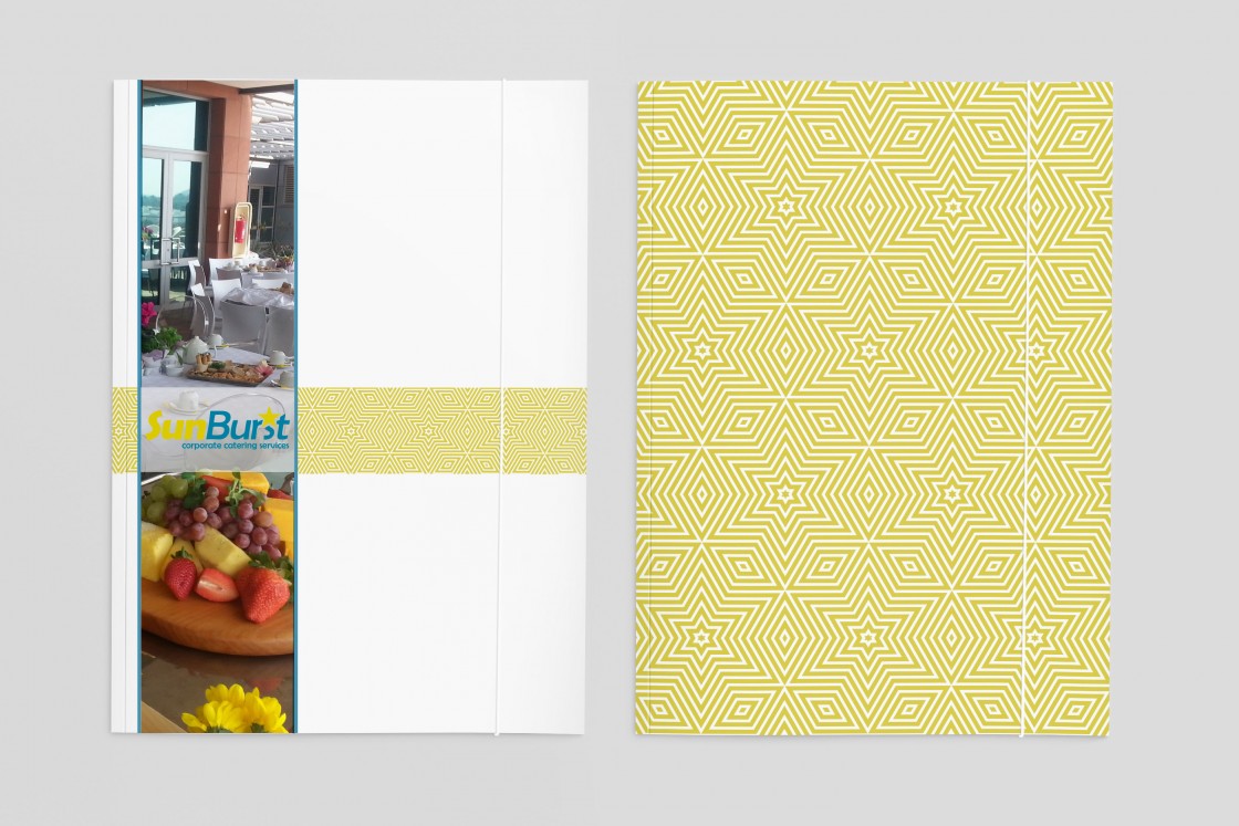
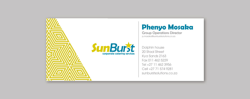
Sunburst
Corporate identity
Business cards
Folder
Email signature
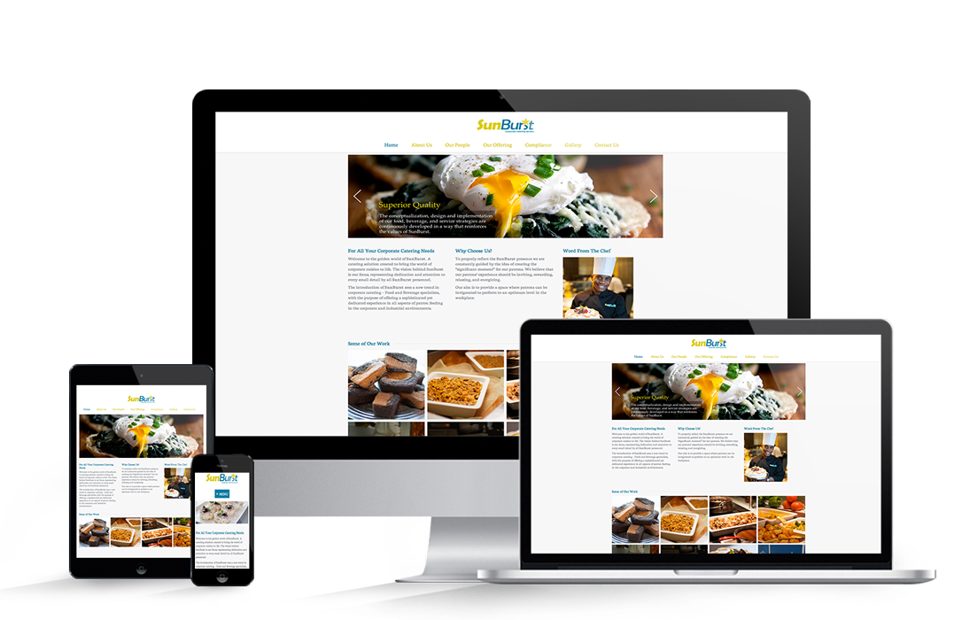
Website
Website reflecting “the golden world of SunBurst catering solutions”, where the utmost focus, dedication and attention is put into every small detail.
View Website
Start A Project