Businesses continue to invest in content marketing on the internet. A website is a 24/7 salesman who works tirelessly for 365 days a year, always selling the objectives of your business and the associated products or service; even when you’re asleep. And like a good salesman, your website’s first job is to capture the attention of your target customers.
Single Objective Focused
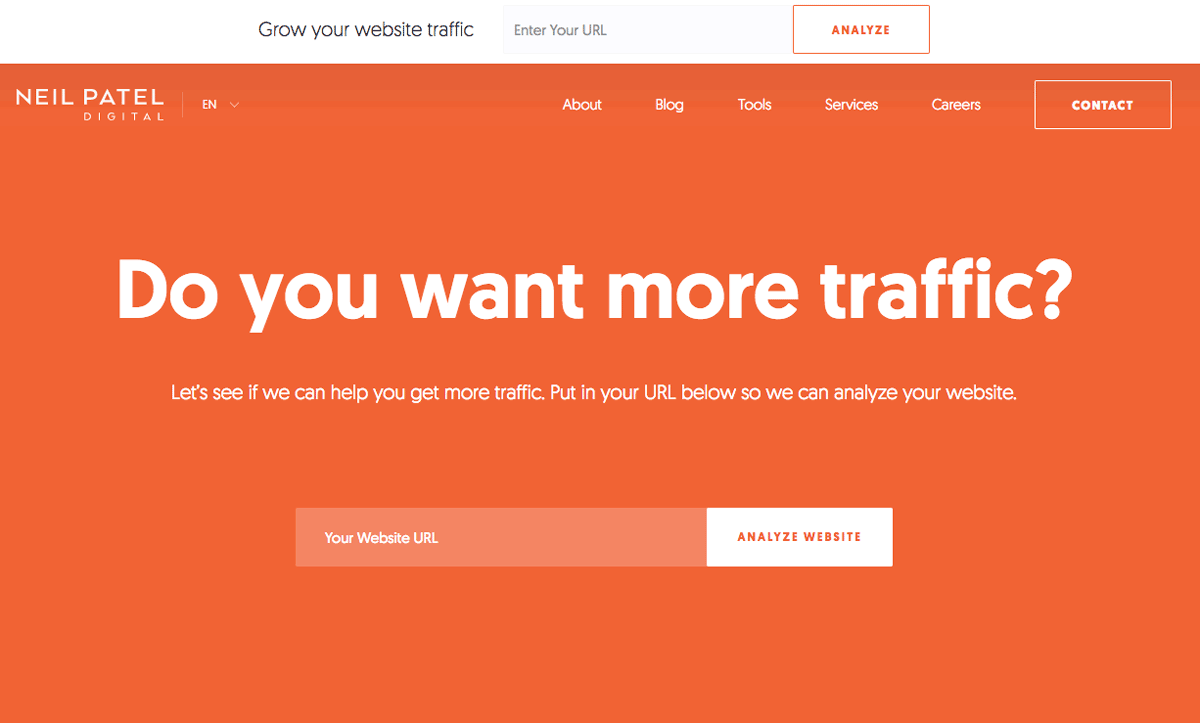
It has been declared! The average human attention span is short. Very short, and it just keeps getting shorter. According to Kevin Mcspaddenas, It had decreased from an average of 10 seconds in 2000 to 8 seconds in 2015. In those 8 seconds, your landing page should tell your website visitors why they should stay on your site, why they shouldn’t go to your competitors’ site or check out what’s happening on other social platforms. We learn from the top interesting landing pages on how to keep the attention of prospective customers and what key factors that make the best of the best catalogued landing pages. Let’s start with Call-To-Actions (CTA) and how this technique can help improve the 8 seconds of viewing on your website.
#1. Powerful Call-To-Actions
CTA function as a tool to prompt the viewers to take a certain action on a visiting website. There are multiple ways that are currently gaining good ratings in proving a successful landing page. The experience-orientated CTA is currently popular for its user experience and is typically action-oriented on a whole phrase (even shorter ones). On the contrary, phrases command the user to activate their curiosity to feed into their customer needs and rids outdated commands such as ‘submit’, ‘sign-up’, ‘register’ and ‘click here’.
Here is what Tomorrowsleep does:

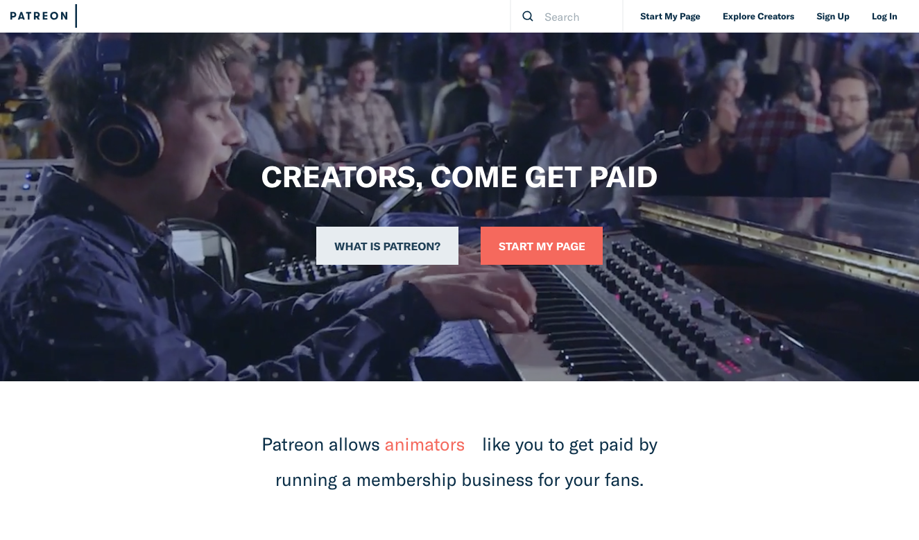
Two CTAs are better than one. This trend counteracts the best practice of having one single goal per landing page, though if done properly, the two CTAs can have a tortoise and hare effect – one being slow and steady, the other competitive and economical. Each CTA is represented as if it’s addressing a different step. The first CTA is for the exploring visitor that’s still researching options. The second CTA is for the visitor ready to engage.
Here’s an example from Patroens’s Landing page:
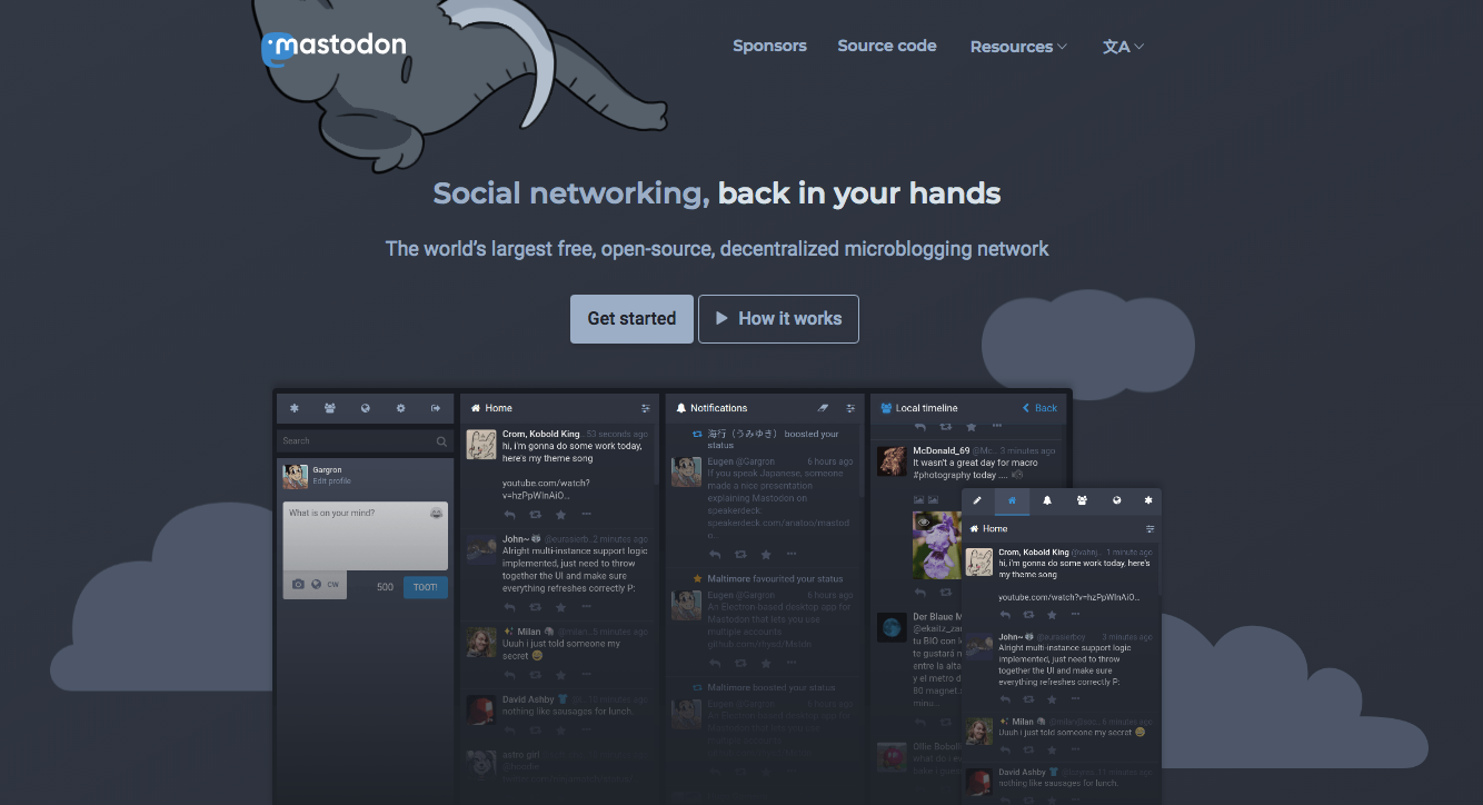
Ghost CTA Buttons are usable with the above two-CTA trends where a landing page can have a ready-for-action CTA as the dominant button and the exploratory CTA as the ghost button. The ghost button is reserved for the conversion that’s passive and detached from the sale, as it were.
This is what Mastodon does:
#2. Quick and Easy Value Propositioning
A value proposition is a promise to the target customer who holds the same value as stated through the marketing on your landing page. It tells them what you uniquely have to offer, why you’re different from your competition and how you plan to deliver. A value proposition communicates the problem you solve, the benefits of your product or business and why you are better than your competition. It includes a message of your positioning in the market.
Your value proposition should answer these questions about your product or service:
- What are you selling?
- Who is it for?
- What do they get out of your product or service at the end?
- What makes your offer unique from everyone else?
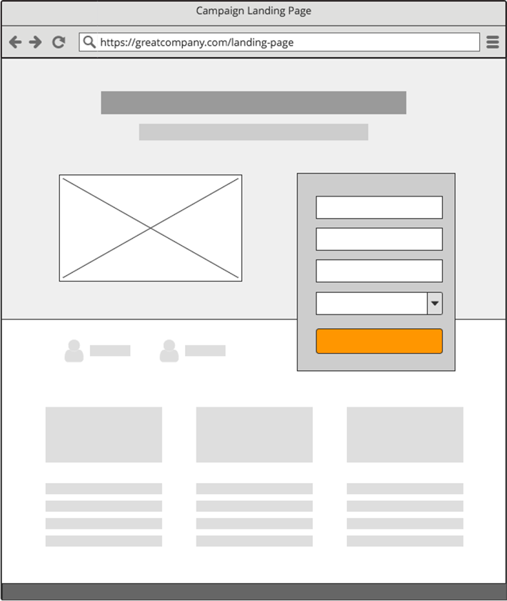
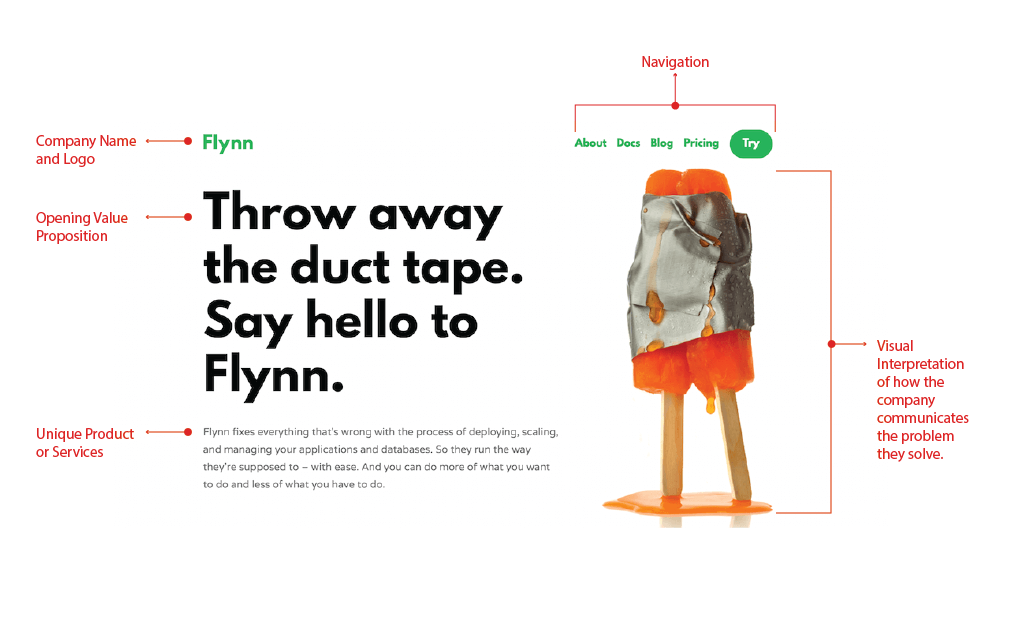
Below is a diagram of how a landing page should look to better understand the purpose of value propositioning.
The best way to learn is by looking over the shoulder of the greats to better understand how you would use your value proposition for your website. Here are two examples of successful value propositions:
- Zipcar
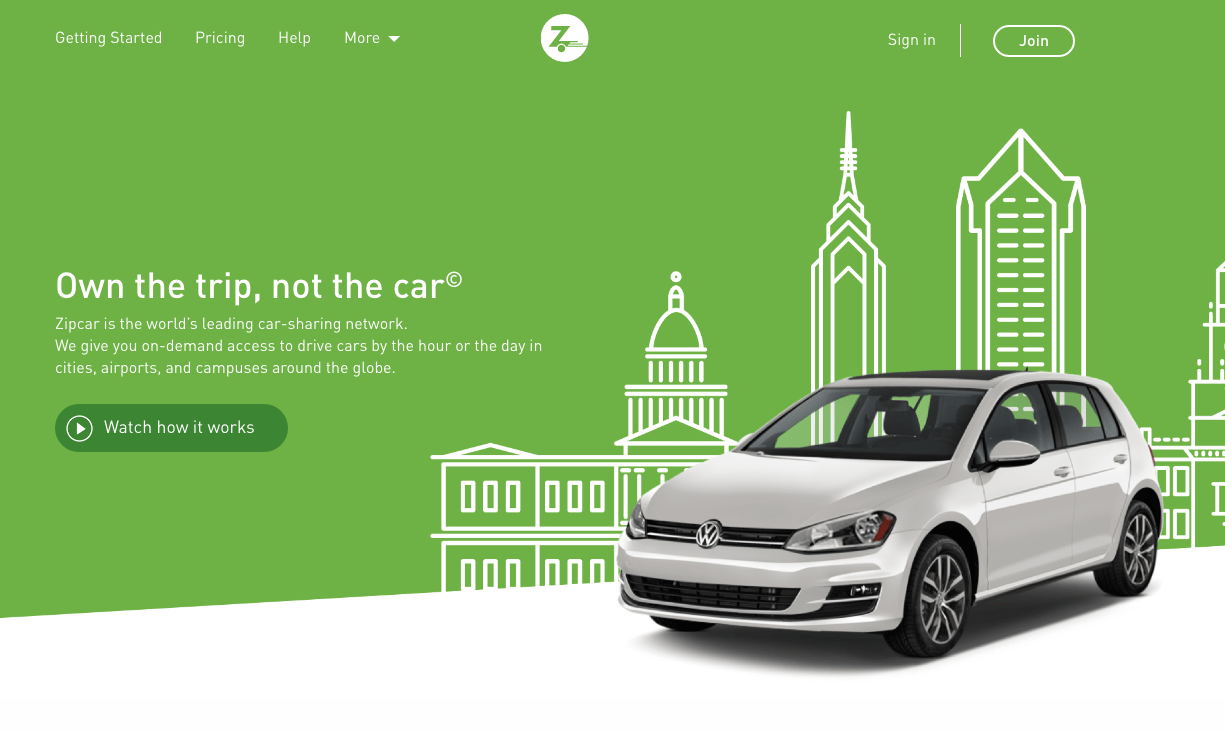
Zipcar instantly communicates what they are about and who they are for. The first value proposition is aimed at getting the customer to rent out their cars for travel/transport purposes. The end result is stated simply in the headline, “own the trip, not the car” speaking to the desires of the average person.
Zipcar then eases into a second value proposition which follows as a paragraph explaining the sort of services they provide aimed at entrepreneurial drivers and other potential customers.
- Hermès

Hermès positions itself as the luxury leather and clothing brand platform for online e-commerce users and potential customers who are serious about high-end fashion. The Hermès brand is ever-changing with different objectives relative to their brand values to display on their website page. In the example above, Hermès celebrates the winners of the ninth year of the international CSI 5* show jumping competition at the Grand Palais.
The first value proposition shows a headline ‘The jump of victory”, where the brand instantaneously infuses an event with the proposed lifestyle or the brand culture brought forward to elevate the brand values Hermès has. The second value proposition is the call to action. The call-to-action, “Celebrate them” is a suggestive invite for the viewer to feel involved and part of the brand.
Hermès takes home top prize for exclusivity, which measures the consistent quality of goods, the brand’s prestige, the valuation of the brand’s customers and its ability to justify a high price point.
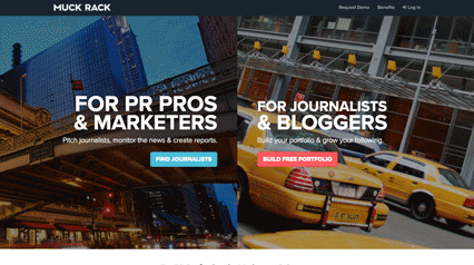
3. Moz
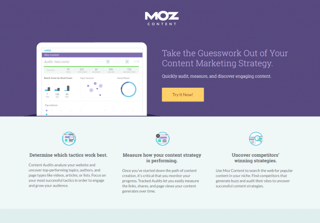
Moz is recognised as a prime search engine optimisation company that also front strategises content marketing online for their customers. In the example above, Moz uses their headline “Take the guesswork Out of Your Content Marketing Strategy”, and the following subheading “Quicky audit, measure and discover engaging content” as one strong value proposition. The bright colour draws attention on the on the call-to-action button to motivate the viewer for one-click action.
The image on the left showcases an inside look into what using the product is actually like in real-time. The footer is minimalistic and doesn’t distract the viewer from converting with links to other pages or social accounts. Social accounts place at the bottom of the page proves to boost protect trust from the viewer for legalisation. Additionally, all seen examples above have a hyperlinked logo that allows prospect viewers to escape back to the homepage.
Lastly, Clarity is key to having a great value proposition. Do not overlook website layout. What was also key is what isn’t there. Links, news articles, and the lines of hyperlinks that were the norm back then. Now the use of negative space and user interface design entice your customer to your main website and they become capable to search for what they want (the idea you sold them) and, nothing more. The following pointers mark other strategic ways to build a successful landing page.
#3. Free Tools
This next trend taps into your visitor’s sense of reciprocity and has proven to be beneficial, as businesses catch onto this trend of offering free tools. Free tools are rewarding if you can afford the development cost.
By offering something for free with no strings attached, visiting users will feel the need to return that favour. What free tools does for our psyche, is to allow consumers to use their natural urge to reciprocate the kindness. In terms of offering free tools on landing pages, your visitors will naturally feel like they owe you the ‘sign-up’ since they took advantage of your free tools.
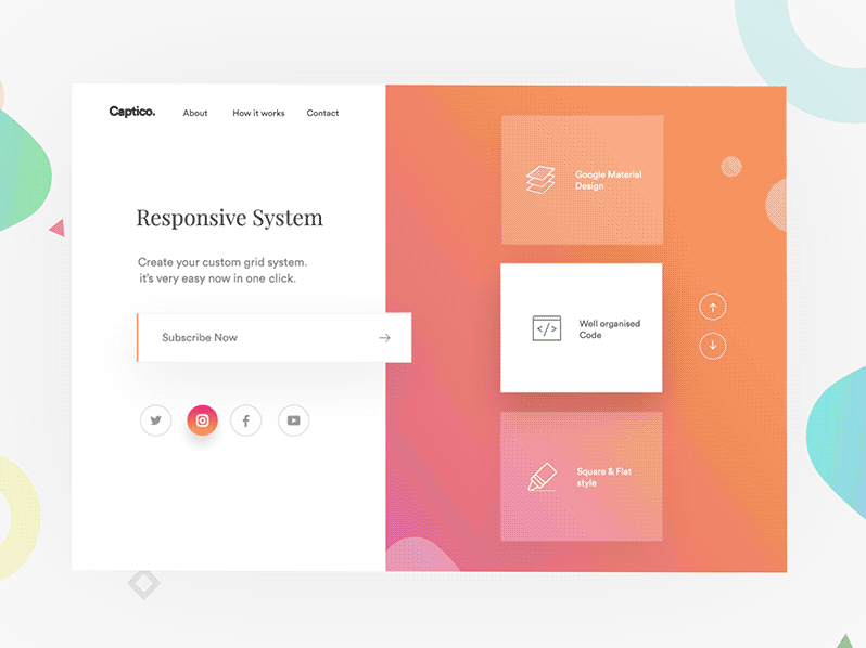
Here is what Captico does:
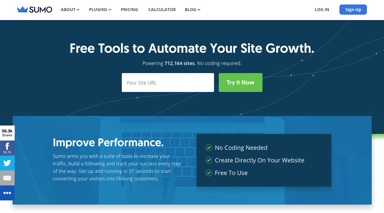
Here’s an example from Sumo‘s Landing page:
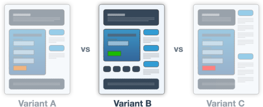
#4. A/B Testing
Webpage testing is second nature to building a website and creating a phenomenal landing page, however, there are series of testing methods that determine the functionality of the opening site and how the structure of your landing page will be visually perceived on screen and other alternative mobile devices. On testing, the most frequently A/B testing occurs for web pages that have testimonials, reviews & ratings, and social media proof functions to determine the conversion rate increase.
#5. Average Word Count For Website
The average word count for a landing page is two thousand and six words. Landing pages increasingly encompass a lot of content; with sixty percent of content consisting of more than a thousand words used. By word count, landing pages differ between five marginal calculations.
The first being nineteen percent of landing pages use more or less than five hundred words as their word count for content. The second is twenty percent of landing pages use a word count between five-hundred and one to one thousand words. The third estimation is twenty-six percent of landing pages that use one thousand and one to two thousand words as their word count for content. The fourth calculation is twenty-six percent of landing pages that use two thousand and one to five thousand words as their word count for content. And lastly, the fifth estimation is eight percent of landing pages use more than five thousand and one words as the word count for content.
The HOOK agency had proposed a question, ‘what length gives SEOs and content marketers’ content the best odds of reaching the top of the organic search results?’.
This was the truthful response:
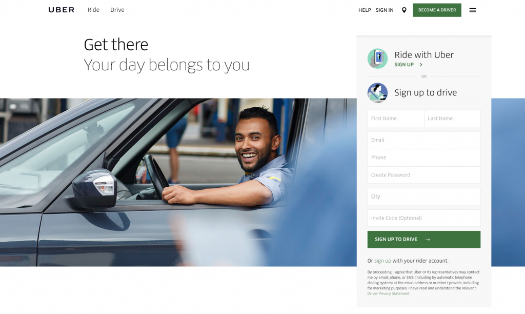
#6. Sign-up page on web
Surprisingly, website landing pages have a subset of sign up pages where the word count is kept short and sweet. Forty-five percent of landing pages find the use of fewer than five hundred words on their signup page as a favourable feature. Uber is the best example of a landing and a sign-up page fused onto one website page.
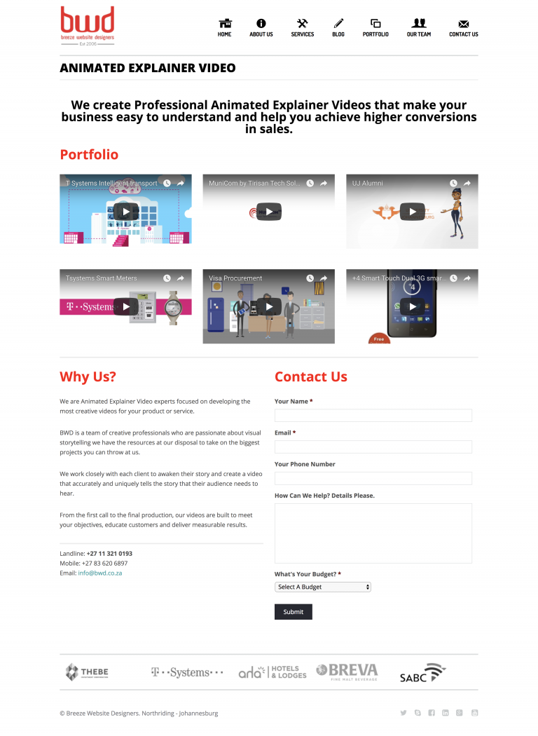
#7. Multimedia and Colour Variations
In the wide stream of competition within the industry, companies are starting to experiment with multimedia. Only fourteen percent of landing pages included a video as a platform to share content. The most popular video platform used was YouTube. Our agency is a prime example of how we display YouTube videos designed by our creative animators on our landing page.
Here is an example of our own agency, BWD Advertising, have incorporated multimedia elements on a landing page:
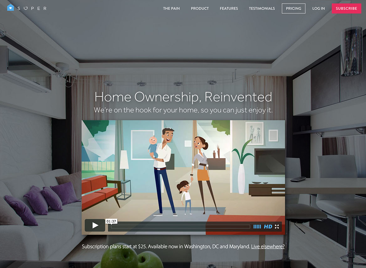
Here is what Super real estate brand makes use of Vimeo:
Undoubtedly, there is still a lot more room for bold experiments, such as colour collaboration for corporate identities looking to compete against other companies. The colour blue and green are the most used primary colours for landing pages at thirty-five percent. The colour grey comes second best at twenty-five percent, black and white hues are on par with the orange and brown at sixteen percent. Additionally, nine percent of landing pages use other colour combinations.
One can naturally make the assumption that companies tend to stick to neutral colours, with forty-one percent primarily using black or grey. Interestingly, only one percent of companies make the use of the colour red. In 2017, most pages stayed static throughout the year, while eleven percent of successful landing pages were redesigned.