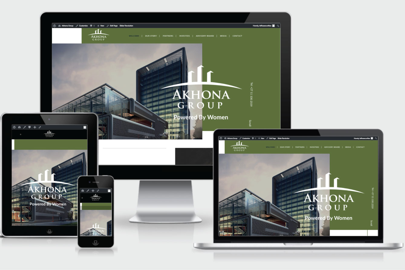
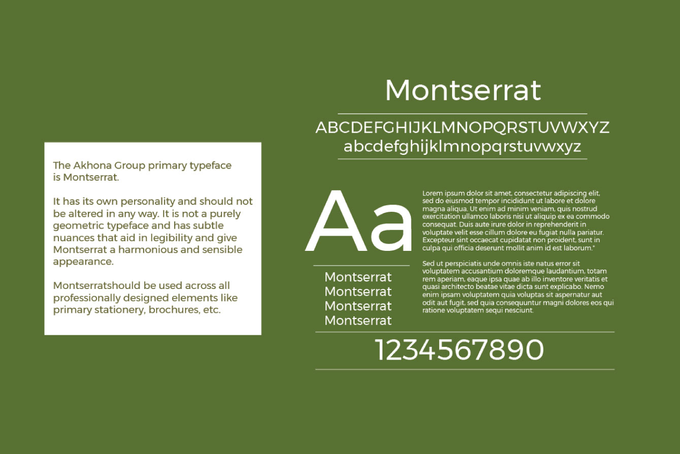
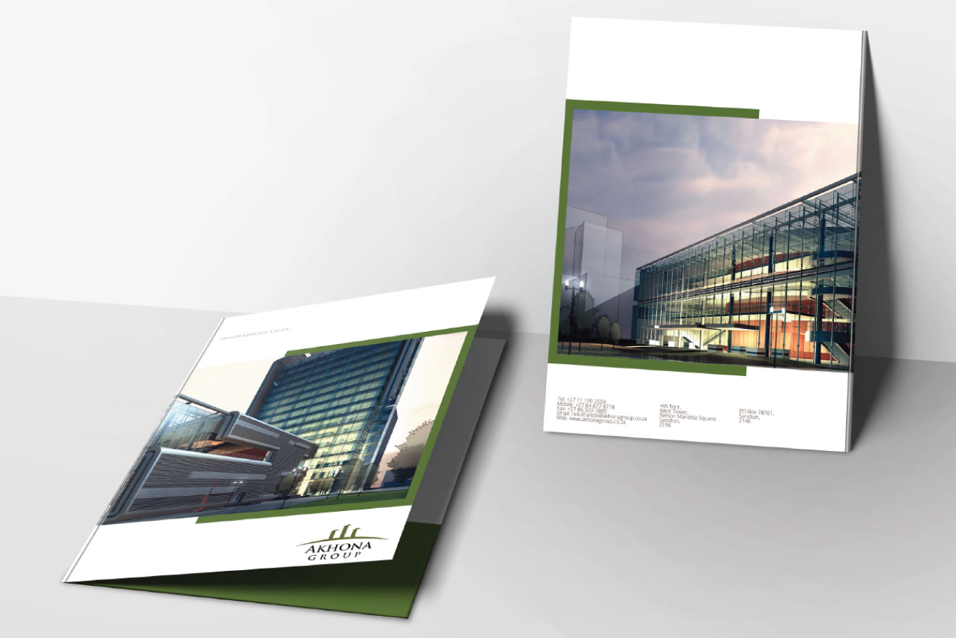
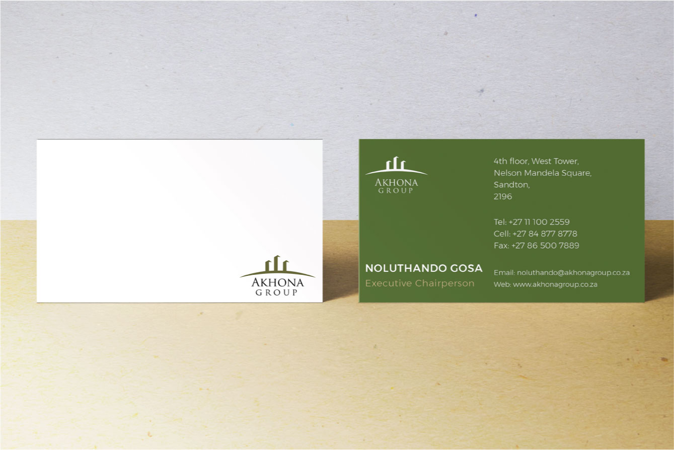
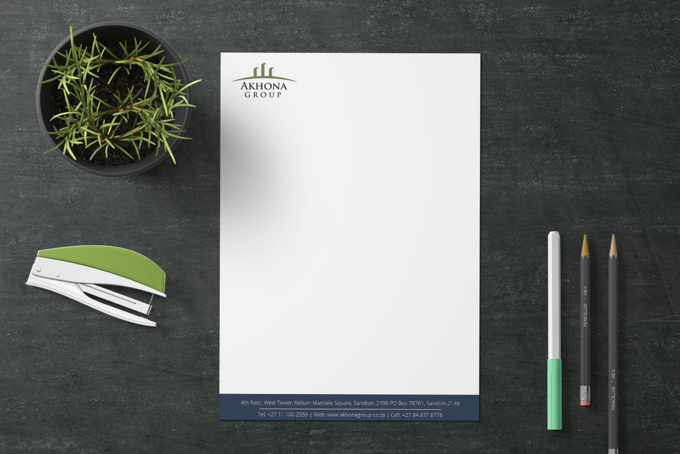
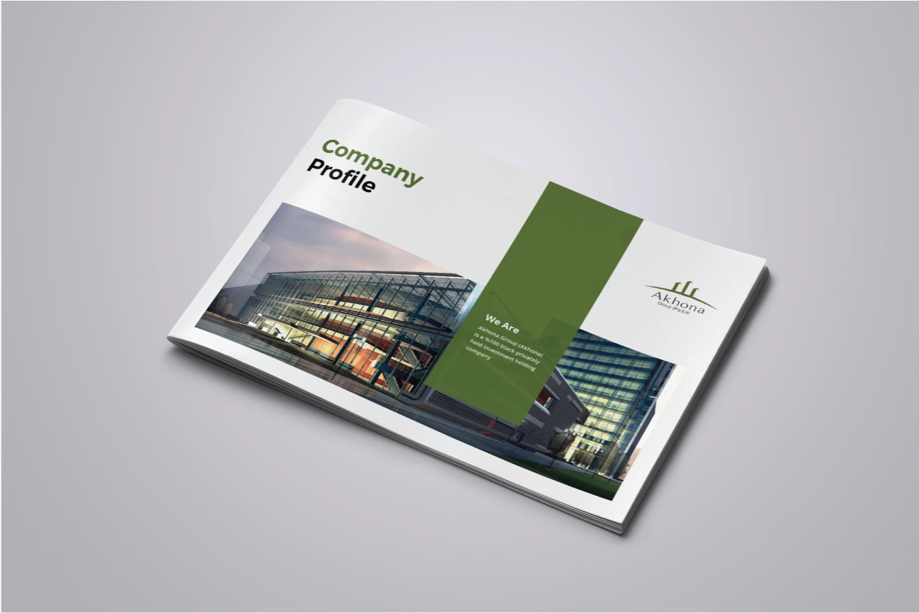
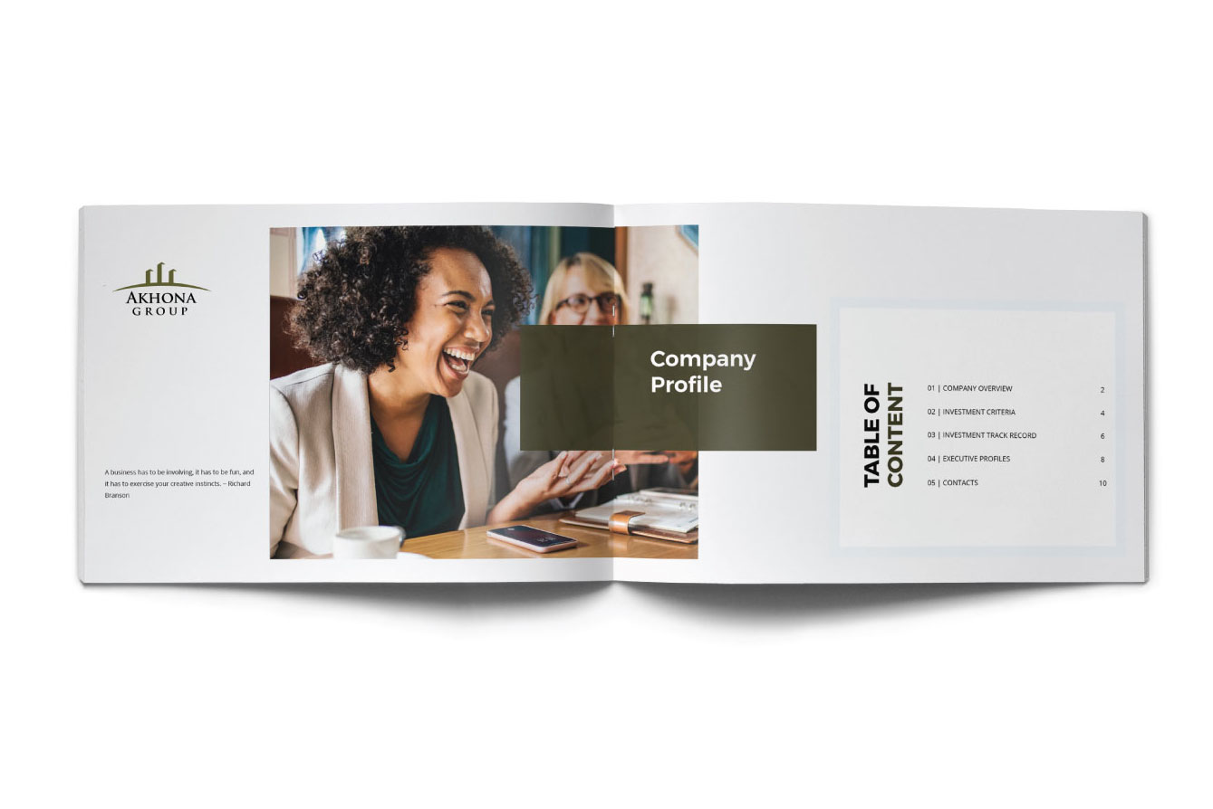
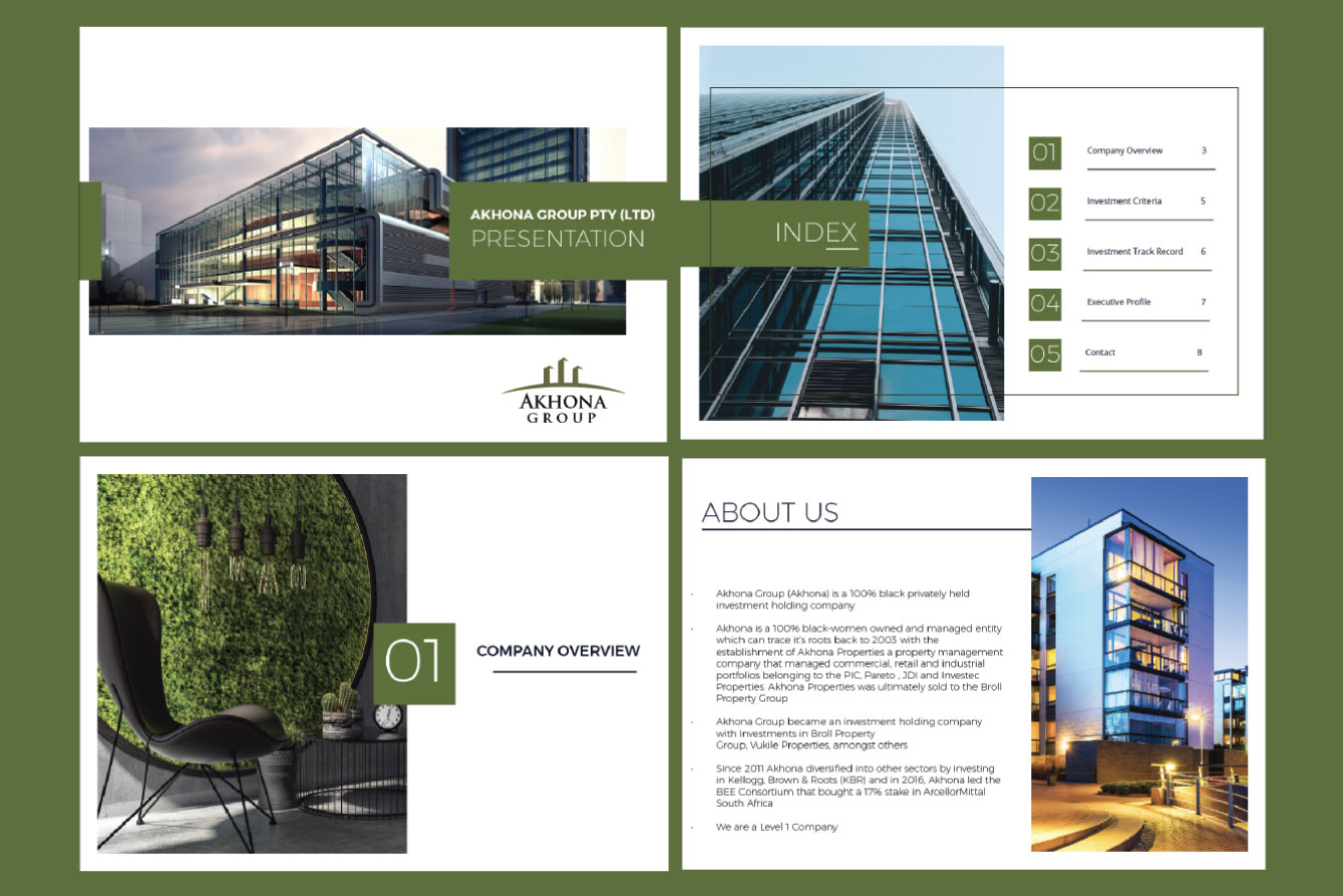
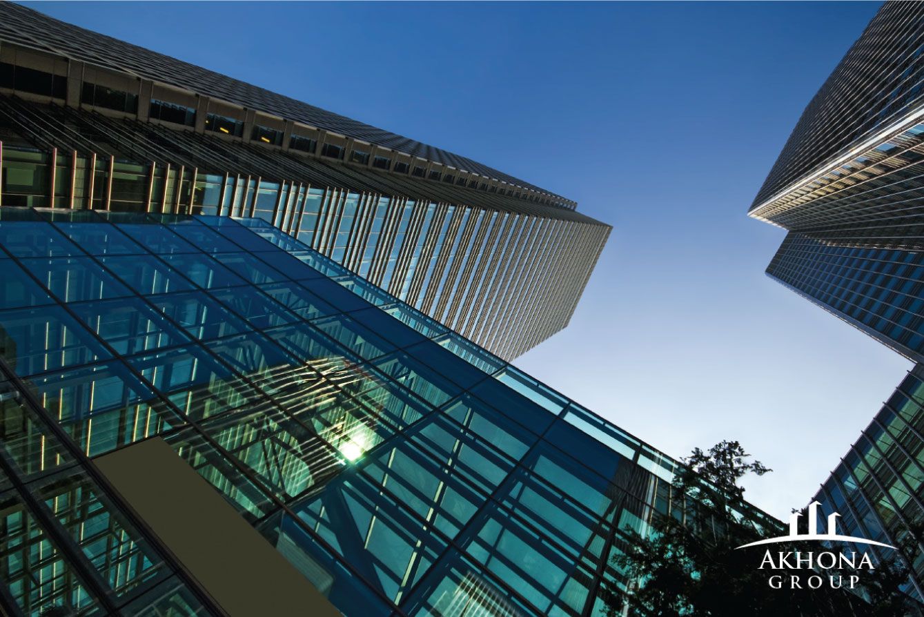
We have created a corporate identity that is sophisticated, modern, simple and elegant . We made sure everything was uncluttered and clean. The fonts used are easy on the eye making it easy for the reader to view.
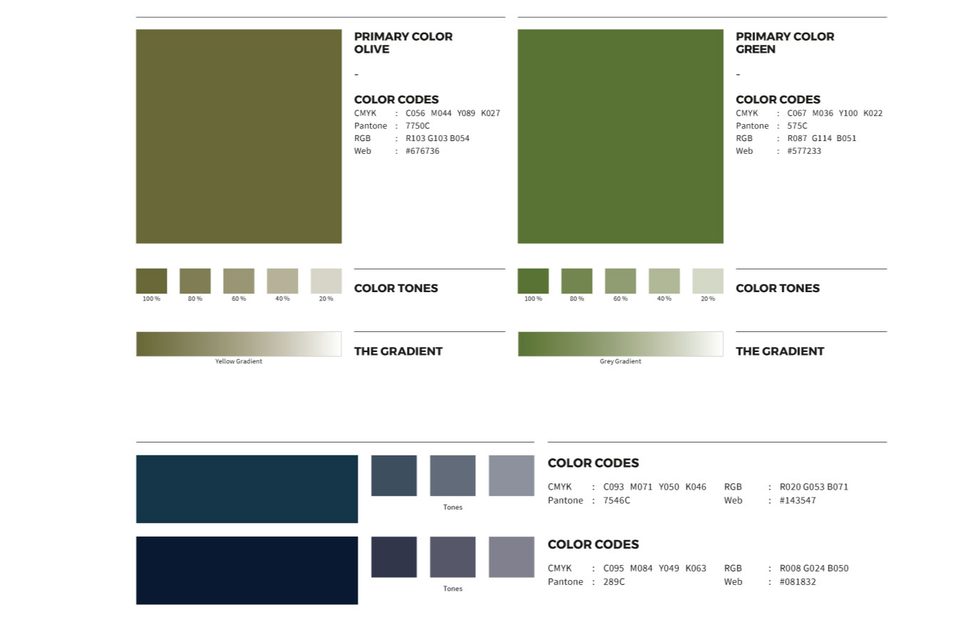
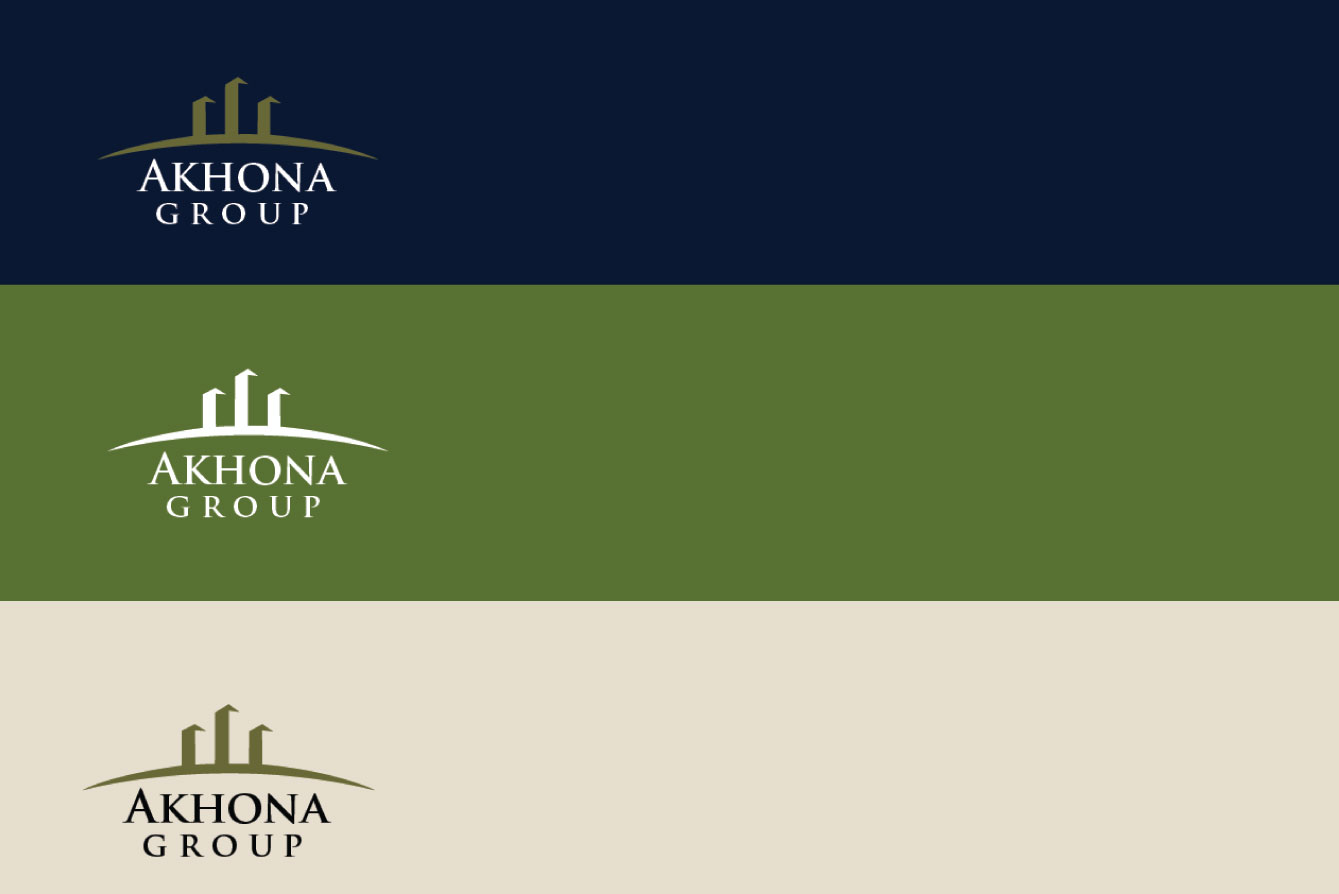
Green— growth, optimism, nature, relaxation, and youth Green is (obviously) a very earthy color, representing new beginnings and growth and symbolizes all things life. In design, green can have great balancing and harmonizing effects. It is considered the color that is easiest on the eyes. Brighter greens are best for reflecting nature and energy. Darker greens represent stability and wealth.
Secondary Colours
While blue is often known to reflect calmness and responsibility. In design, the blues chosen by the designer have a huge impact on how the design is perceived. Light blues can be seen as refreshing and pleasant. Dark blues best reflect reliability and trustworthiness.