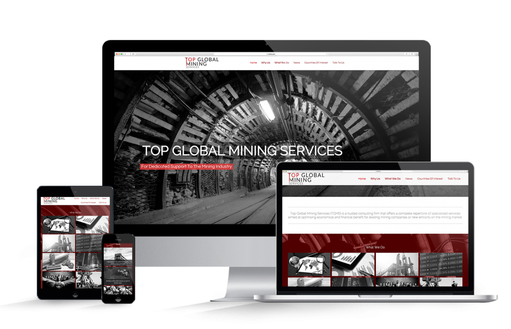
Ever wonder how we manage our web design projects?
Ge a Quotation
The Magical Website Design Process
Check Out Our Web Design Project Plan
Website Design Enquiry
Corporate Identity
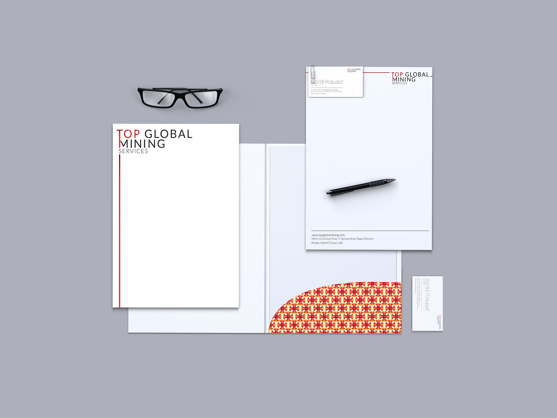
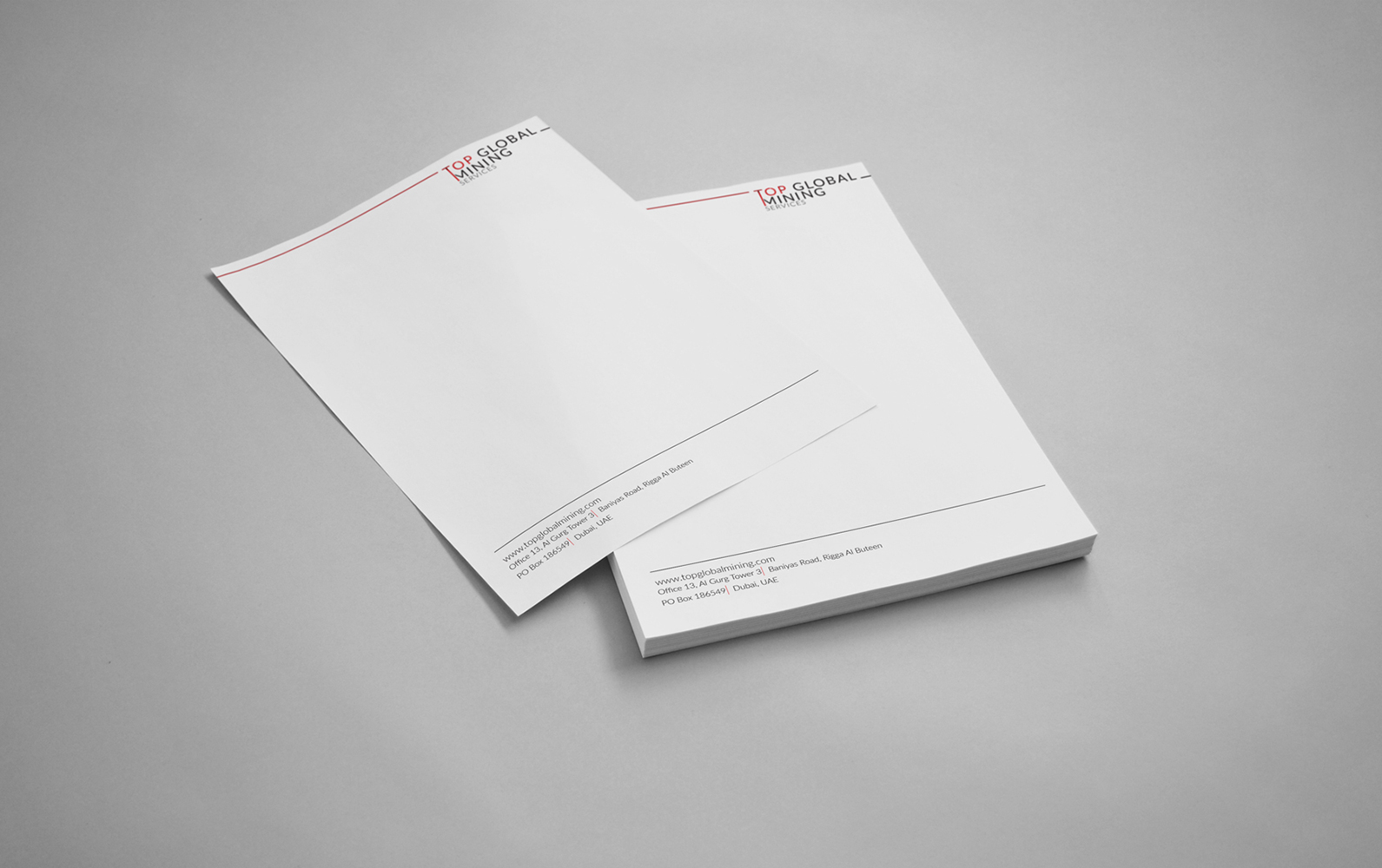
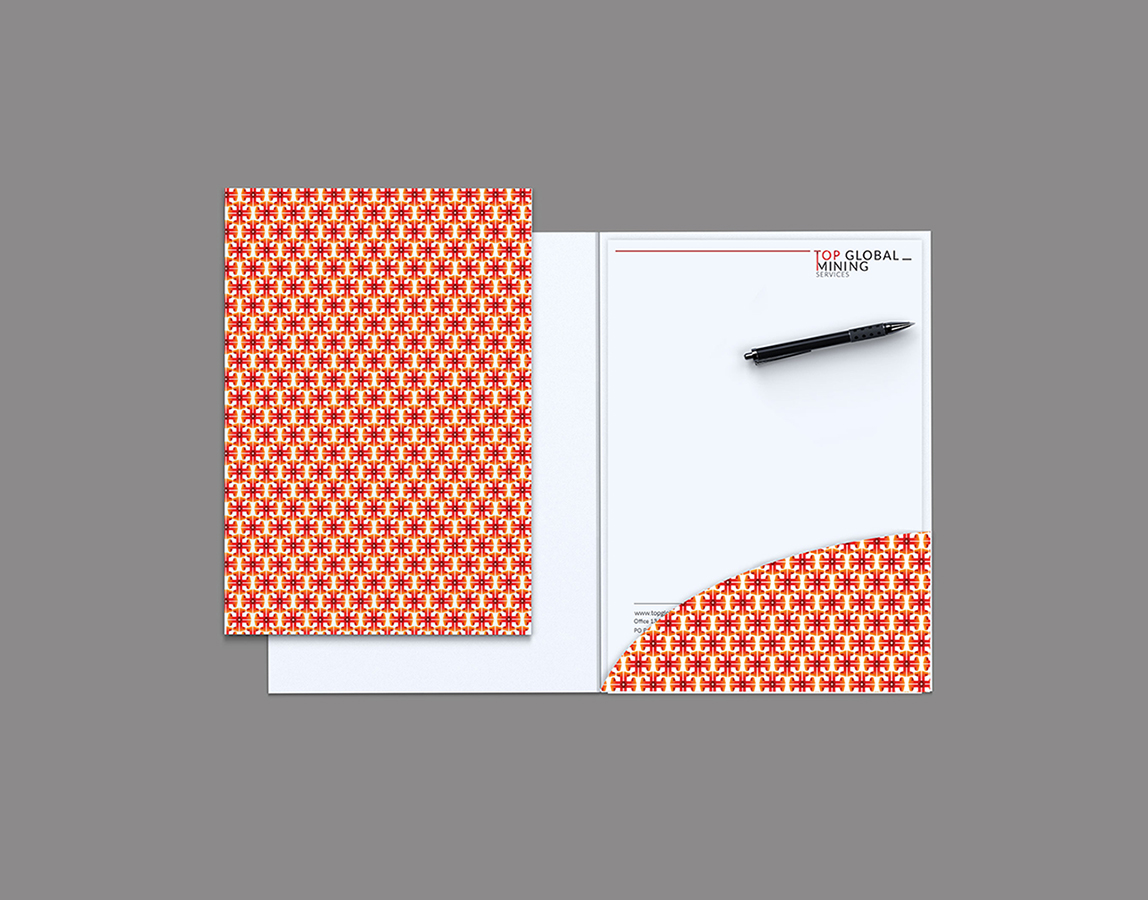
Letterhead
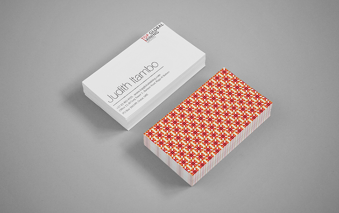
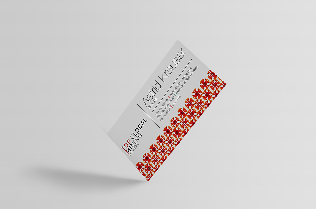
Business Cards
Folder
Email Signature
Rationale
The overall concept is inspired by the imposing form of the mining shaft. The design elements chosen in the logo are intended to be an understated representation, of the many towering mine shafts which are dotted around the landscapes of many cities like Johannesburg.
The logo concept is a typographic representation of the brand, using a strong and assertive typeface to instantly capture the viewer and convey the name, industry and message of the company. The word “Top” takes precedence within the hierarchy of the logo, as the elongated spine of the letter T, is a reference to the vast depths of the mining shaft.
Do you know how we create outstanding corporate identities?