Logo
![]()
Rationale
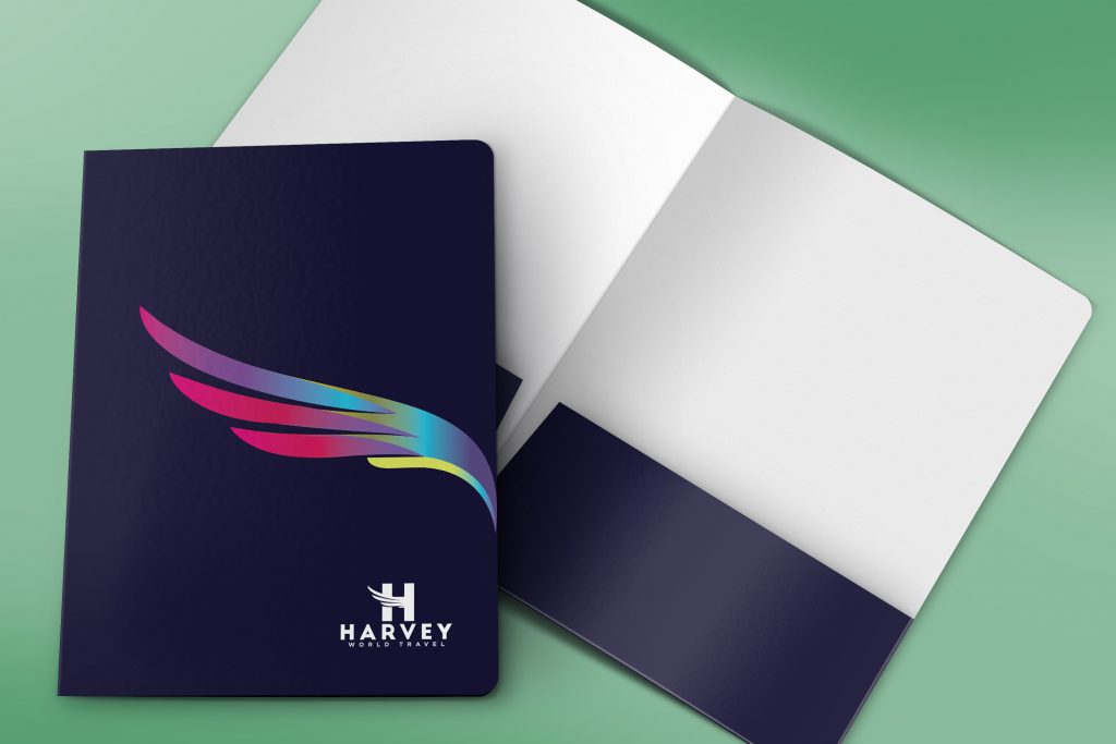
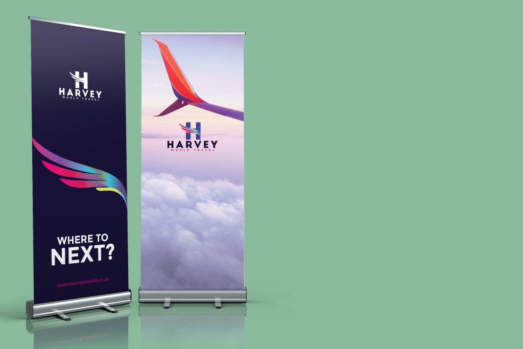
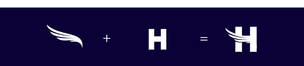
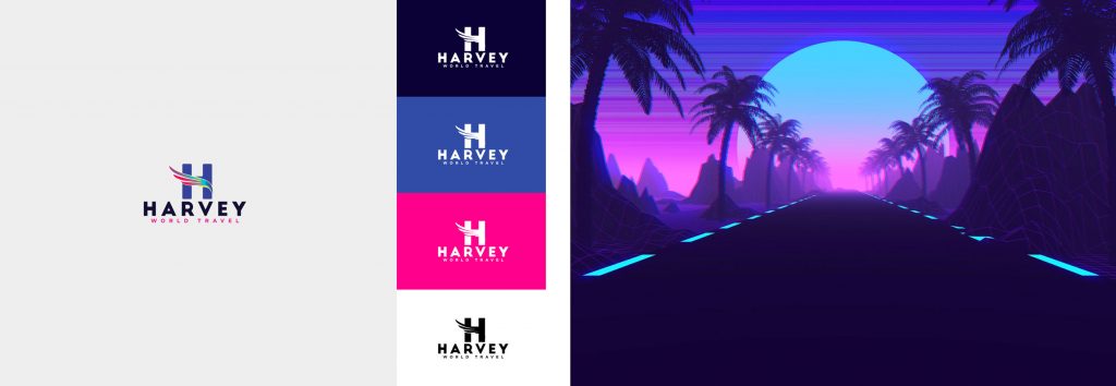
Harvey World Travel provides flights and boat Cruises, and that is travel through air and water respectively which is why i felt like a wing, which is a type of fin that produces lift, while moving through air or some other fluid is a good representation of that. I combined both the wing and the letter ‘H’ to create this powerful icon. The colour Blue is the most universally favoured color of all and therefore the safest to use. It relates to trust, honesty and dependability, therefore helping to build customer loyalty, which essentially what Harvey world hopes to achieve by increasing their leisure clientele whilst keeping their already existing clients. This is a rebrand, and we wanted that to show through the bright wing with a gradient to make it sort of look like a flame and remind you of a phoenix.
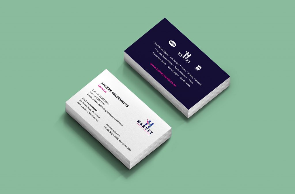
Business Card
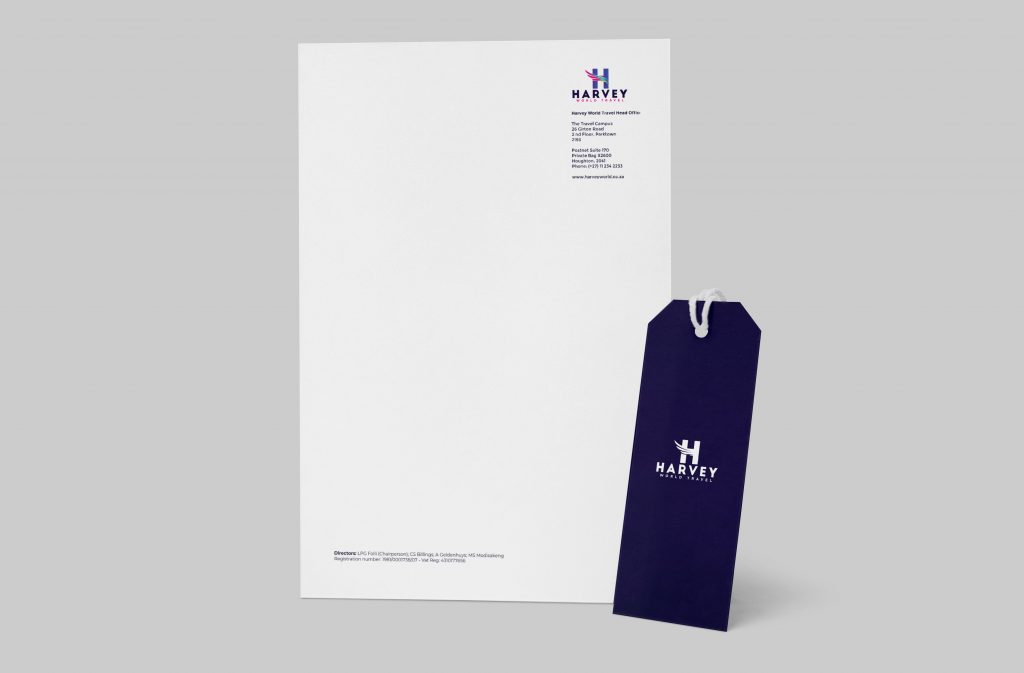
Letterhead