04 Nov How Fonts Relate To Your Logo?
Unless you’ve been vacationing under a rock for the last few years, I’m sure you have had the displeasure of suffering trough “lil’Wayne’s” hair-raising voice. Years of cough syrup and misplaced auto-tune have resulted in the man sounding like a strangled cat, not that I’ve ever strangled a cat but that’s beside the point. The reality of the matter is that something as simple as the pitch of his voice can put people off of his music, never bothering to take into consideration the lyrics or the message. The same kind of logic applies to a brands logo design. The tone of a persons voice is a part of the overall impression, we give to other people, whereas Wayne’s tone may repel some people, the wrong font can completely repel people away from an otherwise exceptional corporate logo. The right font can say the right or wrong thing about your brand, so it’s imperative that you understand what your type is saying about you.


Serif And San Serif
For the most part fonts are split into two overall categories, Serif fonts and Sans Serif fonts. So the next time your designer friends bring it up you needn’t be intimidated by the design jargon, because distinguishing between the two is rather easy. Serif fonts are fonts, which feature a horizontal stroke at the end of certain characters, and by contrast, Sans Serif fonts do not. Serif fonts tend to give off an “official”, If you want your logo to look more authoritative and “matter of fact” try give it the serif font treatment, if should help with that. On the flip side Sans Serif fonts tend to be a lot more common, as they account for the dominant share of the worlds body copy (I mean even this Blog is Sans Serif).
Weight
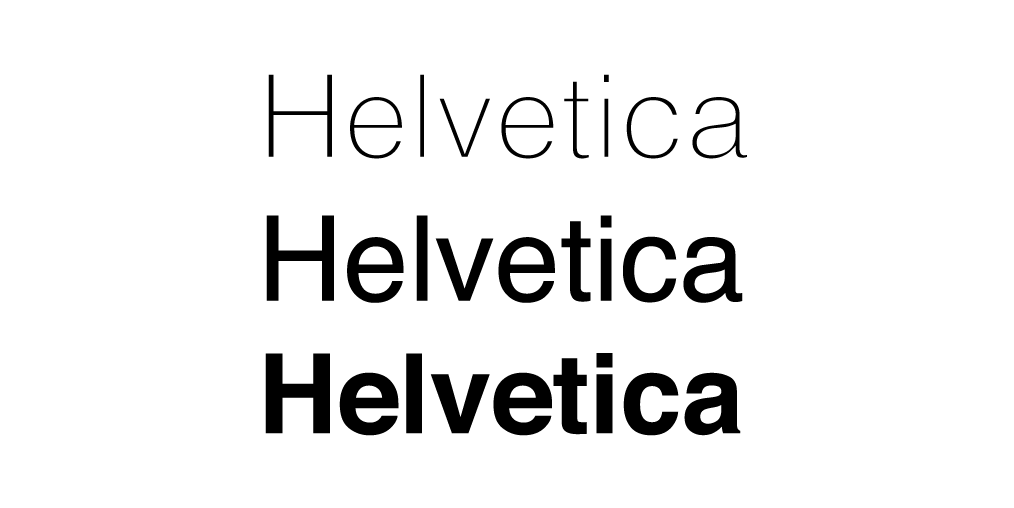
For every type of type there is a weight, much like we Homo sapiens, fonts come in a bunch of different shape and sizes. From bold, regular and light all the way down to thin and hairline. In general the higher the font weight the more forceful the message, but keep in mind that a little subtly goes a very long way.

Script
Script typography is designed mimic the look and feel of hand written text or cursive, this results in very fluid/effeminate characters, which flow into each other. Scrip fonts don’t work very well for general body copy or small sized text, but if you are trying to create a brand logo oozing with youthful exuberance and soft feminine lines, then script font will defiantly do the trick.

Novelty
Now if “lil’ Waynes” voice were indeed a typeface, it would,-without a shadow of a doubt-be a novelty font. Unlike the other categories in this article, novelty fonts don’t share any specific characteristics. The term “Novelty font” is more of and umbrella term for all those eccentric fonts you see popping up all over the place. Whether you are trying to show off a little bit of your playful side or even if you are just plain coo coo for Coco Pops, Novelty fonts will help you flex your own uniqueness. Be sure to tread carefully thou because the wrong use of novelty fonts can result in disaster…just ask a designer about comic sans, its surely the devils work.


