
14 Jan 12 2019 Graphic Design Trends For Inspiration
Certain trends are favored for years, but others lose their popularity and disappear just as quickly as they arise. So, Let’s check a look at the 12 graphic design trends for 2019 below and see if any of them can be your inspiration for this dynamic year!
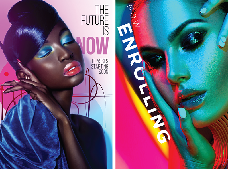
1. Brightness
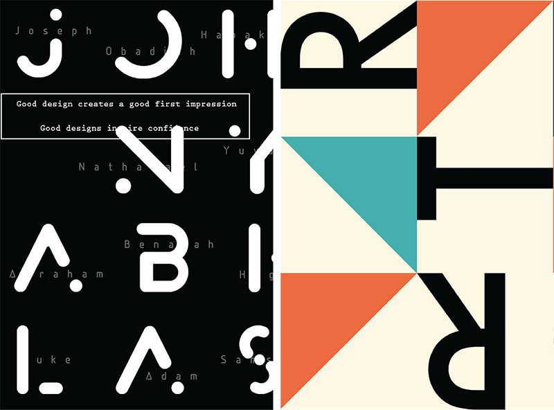
2. Disjointed Text
3. Glitch
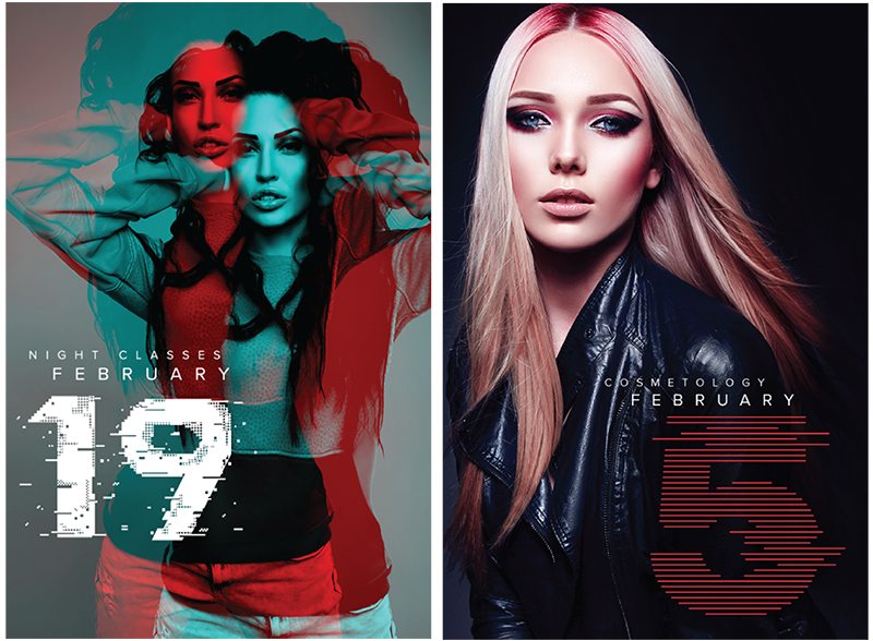
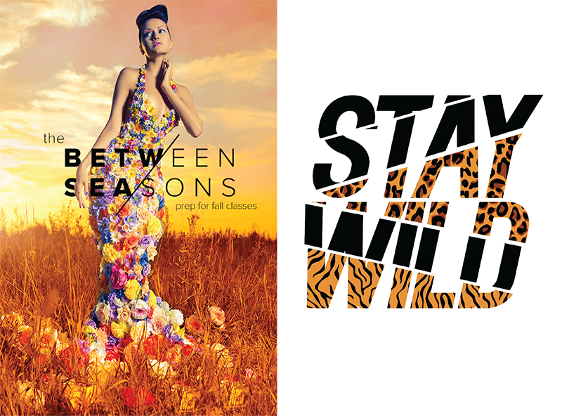
4. Color Channel
5. Slide Text
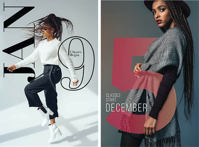
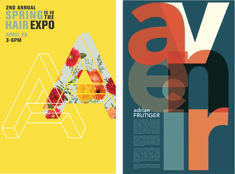
6. Integration
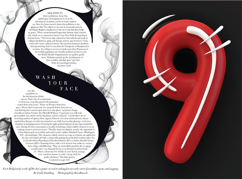
7. Font As Illustration
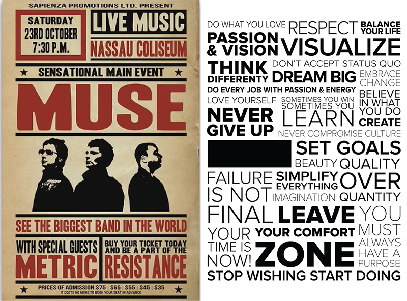
8. Paybill
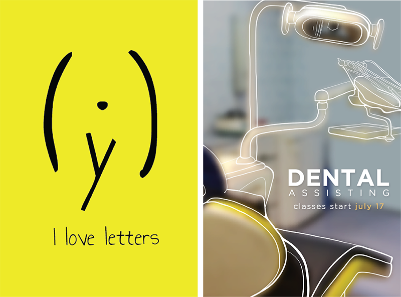
9. Text As Design
10. Liquid
11. Iconification
12. Systematic Color
1. Brightness
Brightness is using a lot of really loud colors. Very bright and very neon colors are juxtaposed with opposing colors or colors that are opposite each other on the color wheel such as purple and yellow.
2. Disjointed Text
Disjointed text is an interesting visual take on typography. The designer is creating a kind of abstract take on the letter forms by creating separation between each letter in the word or phrase. The idea is to bring the message and content into the design but still keep the design more visual rather than something that you read.
3. Glitch
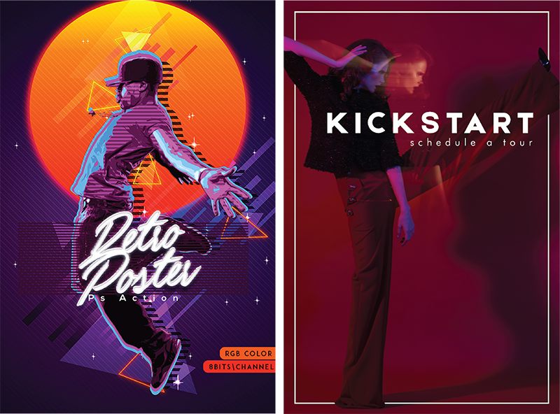
This trend is showing up a lot these days. Glitch is imagery that looks like it’s being transformed or broken up by some sort of digital interference. This design trend can elicit a fascination with distress, deconstruction and the eerie beauty of imperfection.
4. Color Channel
Color channel is if you took some imagery and you broke out all of the CMYK or RGB colors and overlaid them with various levels of transparency. It is trending in both text and imagery.
5. Slide Text
Sliced text is a little like disjointed text but it’s more like whole words are being sliced with an exacto knife, for example. It creates a collage type feel and can give your typography a visual interest.
6. Integration
Integration is where you take fonts or letter forms or numbers and you integrate it very closely with photography. Think of it like the text and the photograph are living in the same physical space. There is always a visually interesting way they are interwoven with each other. This is a very popular trend and can be used in vastly different visual and creative ways.
7. Font As Illustration
Using a font or a letter form or a number form as an illustration element in and of itself. This can be used in conjunction with photography and masking elements of the photo into the letter or number form. The letter or number form can also be used to create the subject of your composition.
8. Paybill
Playbill references old fight posters or musical posters of the 20’s and 30’s or even in the 70’s and 80’s but it’s layering texts in different shapes and different orientations. It’s fascinating trend in methodology that you can use in a number of different ways.
9. Text As Design
This is kind of like text as illustration but it’s different in the fact that it’s using fonts and using text forms as the illustration or design as is. It’s not using any kind of photography or illustration other than the letter form. It might use different font combinations or various scaling and overlaying or cropping to give the design visual interest.
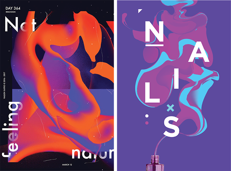
10. Liquid
Liquid is an interesting take on typography and it makes use of visual highlights when you see liquid pooling. It can be used in a 3D or 2D way combining font pairings with liquid traits from ink to paint. There are a number of ways you can address the liquid trend in your designs.
11. Iconification
Iconification is taking photography, illustration or imagery and bringing it down to its most simple linear form and creating to a certain extent an icon out of it. These can be created using depth, gradients and hand drawn elements.
12. Systematic Color
When you do a logo and a brand identity system you generally design it in its higher palette so it looks like an entire system. This can be used in many ways but overall there’s a very tight color palette being used.
Conclusion
Trends exist for a reason, and people are always going to hop on board with what is popular. That means that it’s important to understand trends and why they exist, but to also be able to be playful and skirt around them. Bwd is a great example of a brand that adapts to new trends but also stays forward-thinking and constantly challenges the status quo.