01 Feb 10 Amazing Website Redesign Concepts
Whether you are looking around for ideas, improving your skills, or updating your portfolio – website concepts are always a great idea to improve where someone has left off.
According to Dr. Brent Coker from the University of Melbourne’s Faculty of Business and Economics, humans are “psychologically hardwired” to trust beauty.
We are going to take a look at some South African and International Sites (Dribbble) to give you an idea on how to improve your concepts especially in websites.
Here are the concepts we’ll be looking into:
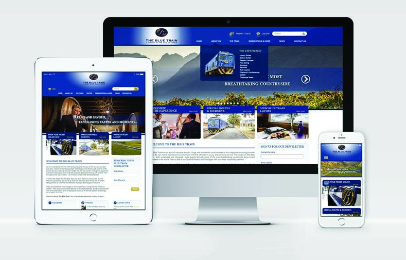
The Blue Train
The Blue train concept has a lot of elements to it. The brand is brought forward in a visually interesting and image-based perspective.
Starting with the header, the background behind the logo has a gradient effect using white and blue. The white section brings attention to the logo so that it can be seen easily and stand out.
The menu itself is nicely spaced and suitably sized, which makes it easy to read and navigate. The drop down menu has been enhanced with an image to draw more attention to it.
The next step would be the slider. The gradient effect has been used to follow on with the same look as the logo. The effect has been placed behind the text, by the means of being dark blue on the right side of the slider and than becoming transparent towards the left of the slider. This creates a nice visual effect on the simple slider.
The rounded edged information panels below the slider are overlapping the slider. This creates a connection between the two elements, allowing it to flow smoothly. If you use the words ‘visual gimmick’ you need to explain it first so others understand what it means.
The paragraph below is well spaced with a line separating the heading from the body of text. A pop of colour has been used to continue with theme colours of the website.
The end result giving us a clean, easy to read and navigate site showing us exactly where all our information is and belongs.
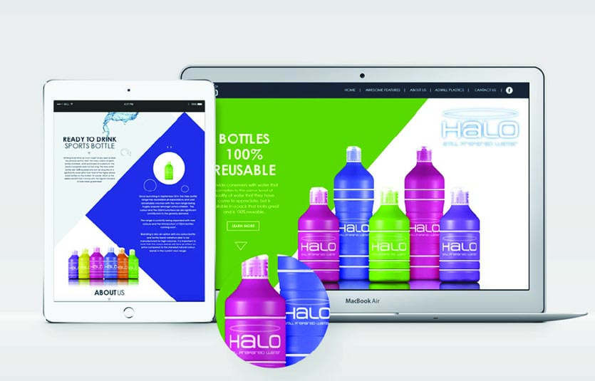
Halo Water
The Redesign of halo had the intention of bring attention to the bottles, they used visual gimmicks such as the use of overlapping the bottle over the shape, to allow for the modern stylish look to be displayed through the design.
The bottle colours have been used in the background shapes to help pull through the company colours by using them as dynamic shapes in the background, the shapes have also been used as dividers on the page to give balance. The images of the bottles have been layered on top to give the illusion of the bottles coming out of the page. The viewer follows the diagonal lines which makes them continue to scroll down.
All the text has been centre aligned to continue with the look and feel of the logo so that it can carry across the feel of being at the centre of the halo throughout the site.
Like the idea of the halo in the logo being a line this has been implemented throughout the page as well by the use of line. For instance the circles on the tablet screen and the rectangle buttons on the laptop’s screen, which helps bring out the line work.
The end result being a fresher feel to it’s brand. The smooth texture of the bottle is replicated in the smooth, easy to follow design of the website.
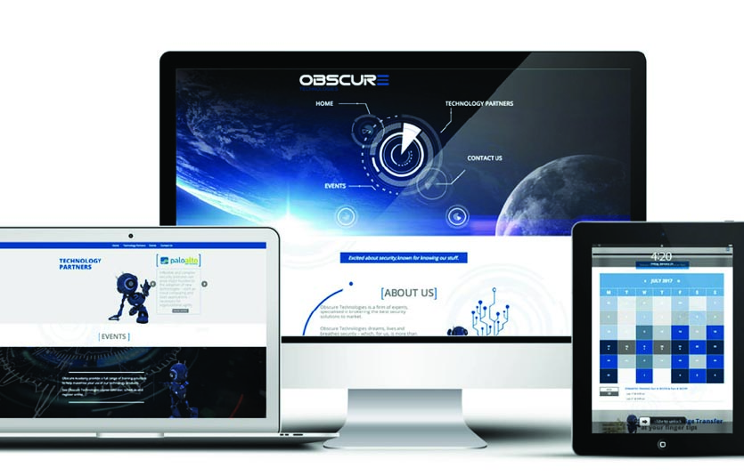
Obscure Technologies
The Obscure site is a wonderful site where they have brought the idea of space and technology together. This is a common and regular relationship associated with space and technology.
Their slider is an interactive control center which they use to navigate their site, creating that an interstellar look and feel as if you are in a ship traveling through space.
The mirror this effect throughout the site creating a space technology exploration the viewer will go on where everything seems to be a virtual window creating a great visual journey through the site.
The use of blue and the visual gimmick of being in a spaceship traveling through space was done well in this modern approach to the website, the use of lines and separating between dark and light helps bring across the technology side of the brand as well as the use of imagery.
The use of a mascot helps us navigate the page as if the robot was a mini guide that helps us through the journey of the page and lastly the use of the watermarks in the background help to tie everything together. Giving the site a overall modern and futuristic feel which is brought forward by the elements and pictures used to bring the site to life.
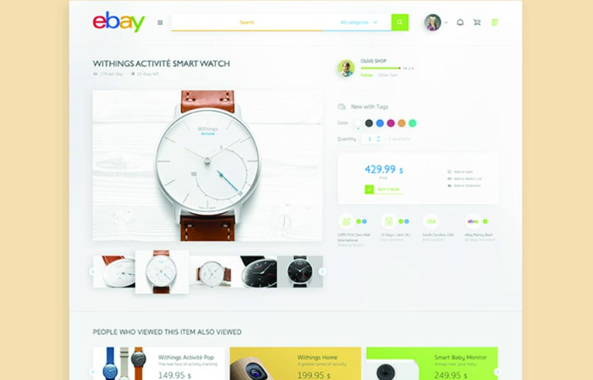
Ebay
The ebay concept design has been made in a slick open design, where negative space has been used to bring the design together in a fresh easy to read manner.
The main product has been oversized to grab one’s attention on what they are viewing also allowing for the other views below it, which are in a carousel view where the image you Hover on overlaps the previous and next picture.
The colours in the site have been taken from the logo to help represent the brand throughout the page, the main colours used are of the yellow a and green y which is the end of the logo which helps stretch out the idea of the logo throughout the page. Also the use of grey and white have been established as separators for the page allowing easier navigation.
The product information has been placed next to the main image allowing for correct spacing and giving each and every part of the page enough breathing space, which makes sure that nothing competes, allowing a easy view of the product and its information.
The related products that people viewed from the main product are shown below it in a image based carousel where the price and product is show in a clean manner.
The overall feel is easy to read, clean and has a nice modern design to it where the product and what it relates to are shown in a modern stylistic manner.
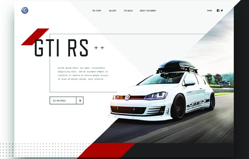
GTI
The GTI RS concept has one thing in mind and that is to play on the theme speed, and that is exactly what they have achieved with this look and feel of the car.
What they have done here is used sharp imagery and overlapping to achieve their desired effect, the blurred background image helps bring out the effect that the vehicle is moving at a very high speed as well as the ability to not see the cars rims.
The use of lines in the background as well as the buttons helps bring out the idea of the slick car and traveling on a track mimicking almost a race track.
The car itself overlaps from its background into the white and grey one to give the effect of it coming out of the page, to give us the impression that it is moving out of it’s own reality.
The use of subtle text helps bring emphasis on the vehicle itself, which would be the main focus of the site.
The triangle effect helps bring a sharp dynamic to the looks and feel where it brings in a fresh and modern feel which helps bring the car into perspective.
Overall creating a slick way to present the GTI to public by showing that it is a stylish, modern way to travel.
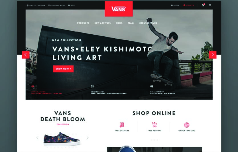
Vans
The VANS concept has been made to represent their culture of outdoor sports (skateboarding) where the first thing you see is a man doing a trick on the one side of the screen while on the other the ad caption for the shoes themselves to help establish what is going on.
The slider has made use of a 3D like effect with the title going behind the skater but with him stim behind the heading text give a impression movement within the site.
The use of the brands red colour is very dominant and where it is placed it overlaps onto the artwork or consumes it’s space to show it’s dominance, which helps push the brand froward in the design.
The use of dark and light colours to separate the elements from each other to help navigate through the page as well as using them as grounding points for the site.
The shoes themselves further down the page have made use of the negative space around them effectively so that they stand out well and are not competing with their surrounding elements.
The style is simple and uses a modern pull to it where the elements overlap each other but do not bring down their design in the process helping for a good relation between the elements so that the brand can be brought forward in a none competing design but instead of a design of elegance.
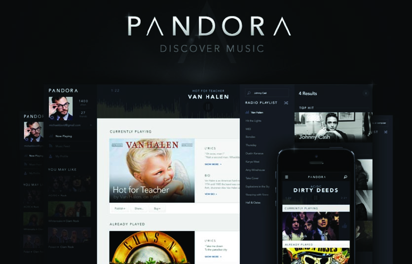
Pandora
This music site concept gives you exactly what you need from a music site, you have your music player at the top and what your playing and have played right below it, with the accompanying tool bar on the left where you will find everything else you need to navigate the site.
The site uses light and dark colours well to bring forward the relevant information as well as to show separation between the elements on the site allowing for a quick and easy read. The site itself has been laid out in a simple 1 column set up so that one can have all the needed information of the artist in one easy view. The use of grey and white has used a separators for the information of the tracks.
A dark overlay at the bottom of each track picture to help bring forward the tracks name and artist, which is than accompanied by the track information on the right.
The use of rectangles throughout the site is established well and helps bring forward the brands look and feel with a easy to navigate platform.
Overall the site does not compete with itself allowing a easy flow through the site making it nice and easy for whoever is using it.

Rolling Stones
The RollingStones concept has been made with a simple yet effective tone to it’s design, whereby they used a man image banner, which incorporates a newspaper styled text format, that goes over the picture of the man but does not go over him in a way that will take away his effect on the design.
The use of line in the form of simple separators as well as rectangular objects, have been used to show separation between headings and titles in the page to help one navigate between the main points. The imagery has been used to help the viewer have something else look at besides text, so that there will not be a lot of strain on their eyes.
To break away from the image they have gone with an eclipse approach to help bring out a small extract from the artist before going into a column styled hard copy, where the main information is placed in a magazine style so that the information comes across the way the brand establishes itself in the world.
The page uses the white space to it’s advantage showing the reader an escape from the other elements on the page, allowing us to connect with all the elements safely and easily, giving the overall effect one of relaxation and calm.
Overall the page takes a magazine like feel, which makes use of it’s negative space and imagery to bring the page to life.
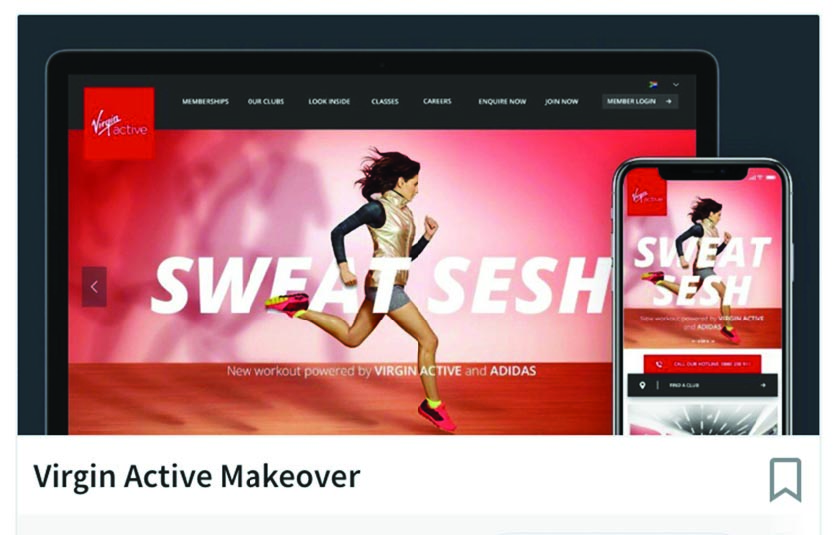
Virgin Active Makeover
This concept takes on a large image where we see a girl running and the caption sweet sesh.
She also has her shadows which seem to be her previous times chasing her so to add to what going to gym means, which is improving on your old self.
The style of her meshing with the caption creates a nice overlapping effect allowing the image to come together with the words creating a relationship between the image and the text.
The logo bleeding into the image shows us that the site connects together well and creates a nice relationship between on the images allowing the picture to bring up what the brand stand for which is to sweet out the old you.
The site uses imagery as well as light and dark colours to separate it’s elements allowing a easy navigation throughout the site. The use of red is very prominent so that the company colours can stand out well, allowing for an impression of the brand throughout the site.
The site is a very slick and modern feel to it, where everything is a easy view and easy to navigate through allowing customers to get where they need to be without any difficulty.
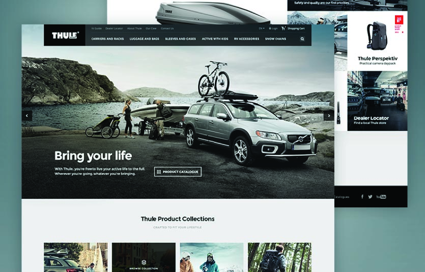
Thule
This brings us to our last but not least site; they have used images to represent themselves in this concept playing around with the box effect to bring forward their style, from the header to the products page everything has been laid out in a neat square and rectangular fashion.
The main slider has been made in a simple yet effective manner by basically allowing the artwork to tell the story and than just helping the viewer along with a small caption followed by a way to navigate to the products page.
Using center alignment for the heading, they also use light and dark colouring to separate the elements from each other allowing for a nice comfortable read through the site.
The use of checkered effect to help allow us to have a nice view of the products and as well giving us a easy navigating view. The use of light and dark colours to bring separation throughout the page.
The elements make use of the space correctly so that they do not compete with one another and take away from the design.
The site has a simple yet effective finish, where they make use of rectangular shapes as well as light and dark colours to bring the site together, helping us navigate easily and freely through the world of Thule.
These are just some of the concepts out there today, there are many for us to go through and have a starting point or just to get some inspiration from the world today.